get 500+ free images, templates & marketing strategies! You're one click away, Don't Miss It.
The Smartest Ways to Pair Stock Photos With Your Brand
This post may contain affiliate links. Please read the disclaimer

If you’re not a professional graphic designer and don’t regularly do your own brand photography, then you’ve probably encountered the challenge of keeping brand consistency.
You’re probably like most who are accustomed to spending time that you really don’t have to spare looking through stock photos and searching for the few that contain your perfect brand colors. After a while, you probably end up doing one of two things with the photos you find.
Typical Option #1: You try to only use photos that have your brand colors in them.
Typical Option #2: You try to use every photo you find, but you add an overlay to the ones that don’t have your brand colors.
Although these two typical options are fine, the truth is, you can probably use many more stock photos for your brand than you’re currently using. You just have to know more about the science of color in order to do that.
Brand Colors & Overlays Aren’t Your Only Options
By sticking with only those two options I mentioned above, you’re missing out on photos that can help your brand stand out on Pinterest, Instagram, and Social Media.
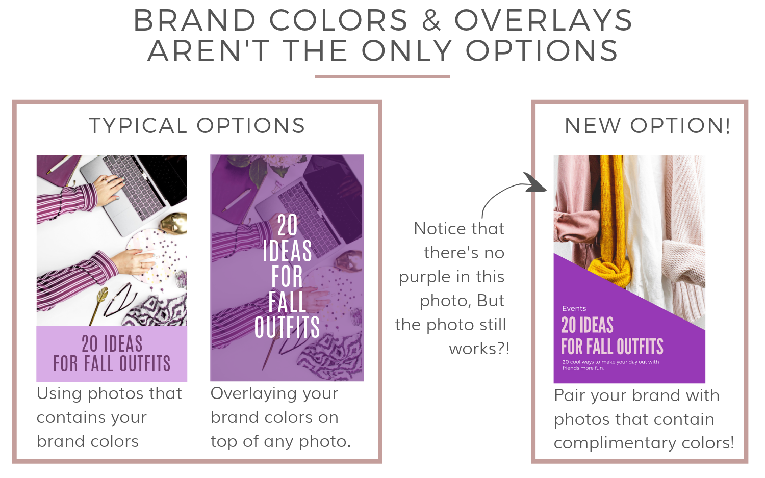
Pair your branding and your color palette with photos that contain complementary colors, like the example shown above, is one idea you may not have thought of. In this example, I’ve paired a photo with a strong yellow color in it with a purple brand color palette. Pairing your brand with a complementary color is an option you can use instead of searching for only photos with purple in it.
Complimentary colors are something I’ll mention more as you read further. You’ll get a full explanation of what complimentary colors are in a moment. But, we should first talk about the science of color and how it works.
The Science of Color Can Help Your Brand Stand Out
Understanding the science behind why so many colors and color schemes compliment various photos can help you transform many photos to work for your brand. Only when you learn more about how color works, can you use the knowledge in your branding, graphics, and projects to get more mileage from stock photos.
For instance, due to the science of color, I’m able to pair hundreds of color combinations with this one photo below. Want to know why? Scroll down!

The photo is neutral – that’s why.
Neutral Color Palettes in Photos
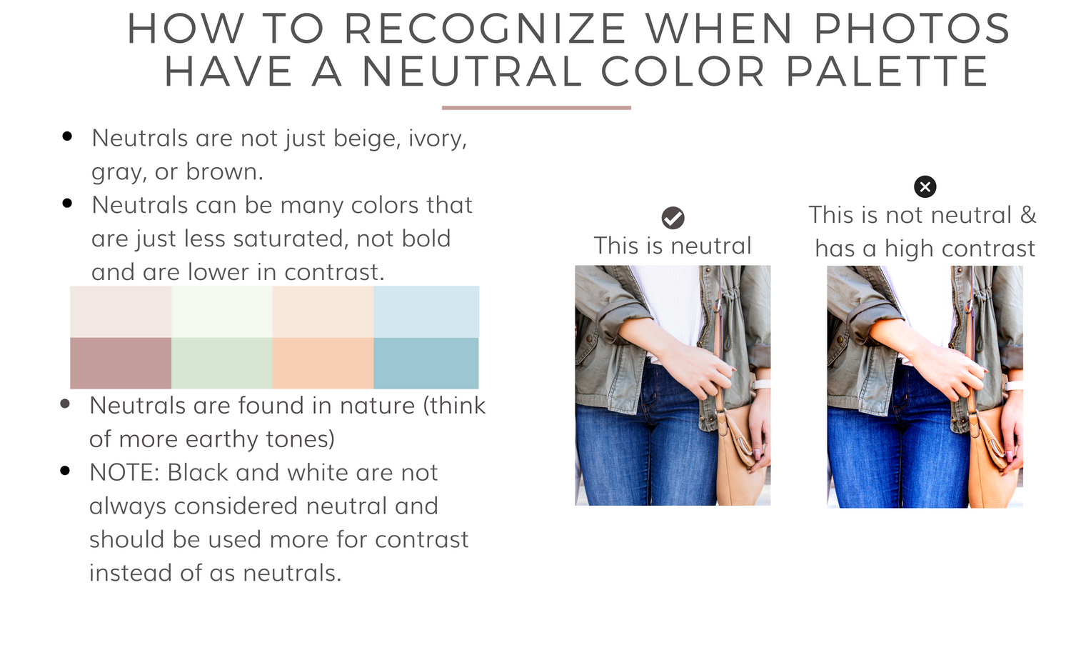
Neutral in photography and color theory means that it doesn’t have a strong color presence. Even the blue of the denim is fairly neutral to the eye and that’s one of the reasons we pair our best blouse with denim and heels. It’s also why we paint the walls of our homes various shades of beige and white. It’s neutral and allows you more wiggle room to play with color.
Neutral is another word you’ll notice me mention a lot as you read further.
Neutral colors are crucial to a brand as they are here for you in a completely supportive role. You’ll probably use them for your fonts and text, but you can also use them in your photography too.
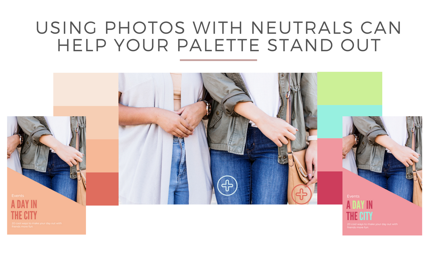
Neutrals won’t compete for attention with your brand’s “hero” colors. They can help your strongest and most bold colors stand out and be the commander of attention. The next time you go hunting for photos to use, you should head to the neutrals and browse a lot more than you currently are doing.
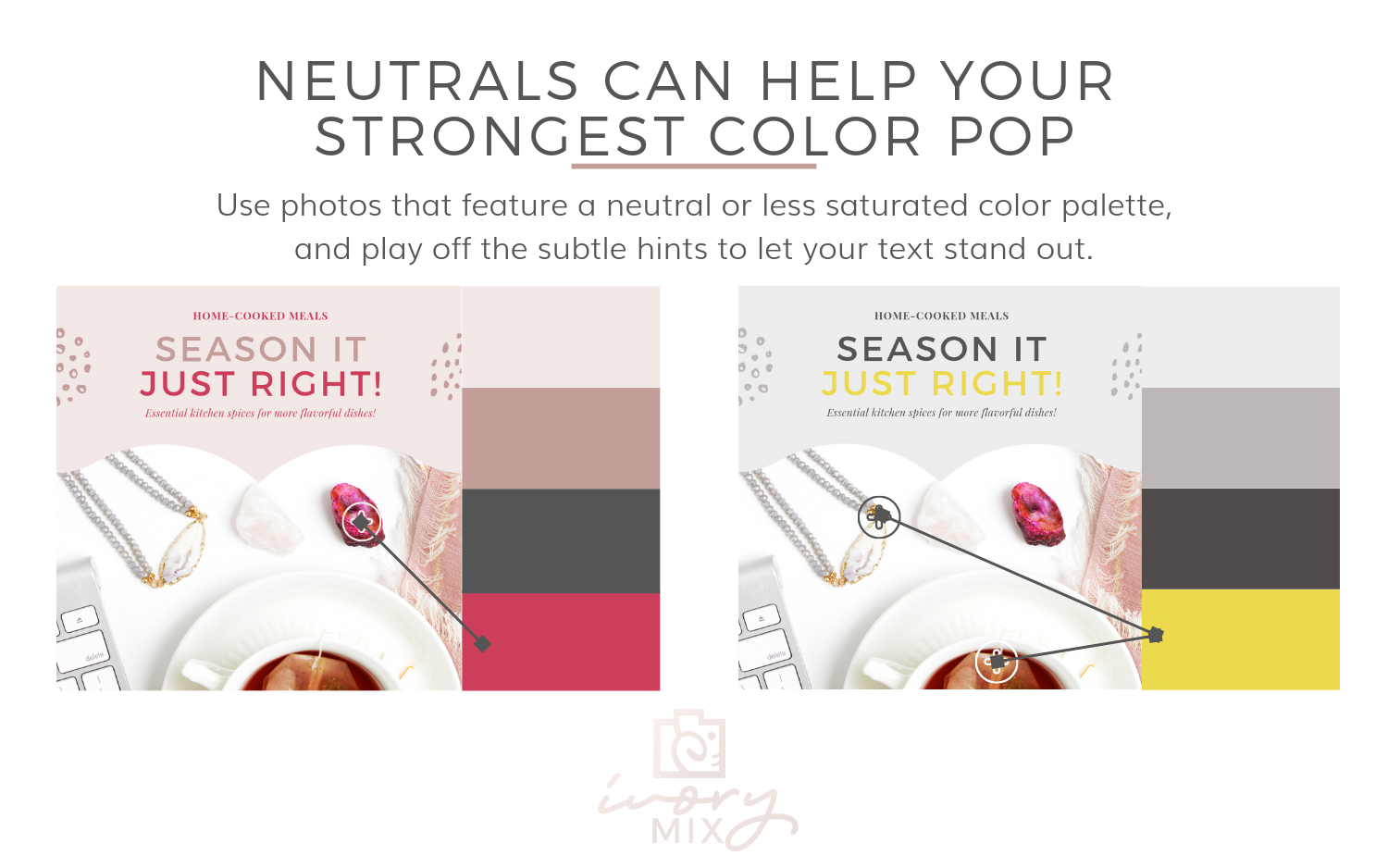 You might be surprised that neutral color palettes are desaturated colors, but can still include shades and tints of blue, green, purple, yellow, and even red. Neutral colors are not the type to take center stage and distract your attention which is why they work perfectly as a supporting element in your brand.
When you create your Pinterest pins and graphics, you instinctively want to grab your audience’s attention with eye-catching font’s, colors, and images.
So, you add all.the.things. Bold text, bold colors, bold photos. But, sometimes, too much of anything is a bad thing.
By using a neutral, but also stunning image, you can still be sure that your graphics and branding will grab the viewer’s attention without clashing or competing with your colors or fonts.
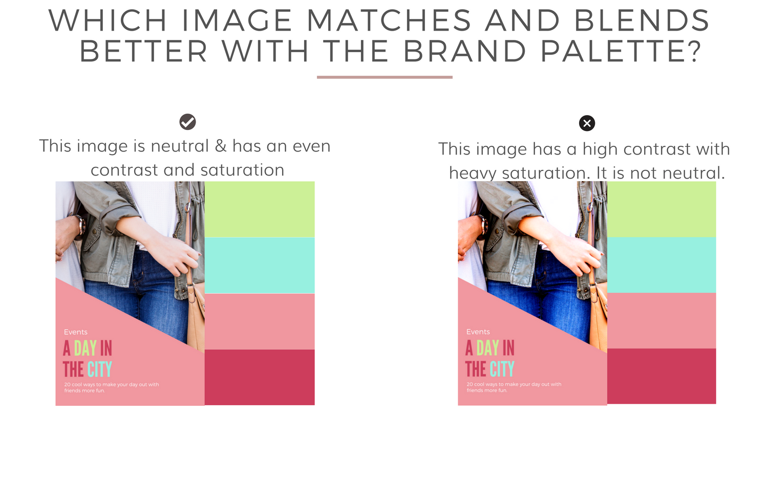
Neutrals aren’t the only types of photos and color palettes you can look for. There are many more options for you, but in order to fully realize all of those options, you should learn more about the science of color and the 5 common types of branding color palettes.
5 Common Types of Branding Color Palettes
Colors have relationships like people have relationships. Like you, colors can have an immediate family, cousins, best friends, small tribes, and communities.
Some color relationships are more intimate while others are broader.
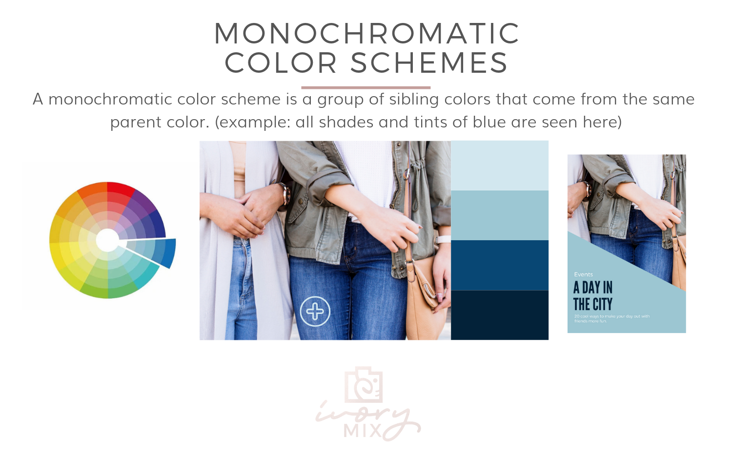
1. Monochromatic (immediate family)
A monochromatic color palette is a scheme of colors that come from the same family of colors. Think in terms of all hues, shades, and tints of blue as seen here in this example below.
Monochromatic palettes are one of the most popular color palettes used in branding but that doesn’t mean you’re going to look like everyone else or that you have to use photos that only use your monochromatic palette.
If you have a monochromatic palette, keep reading because I’ll be giving specific tips for matching photos with your brand!
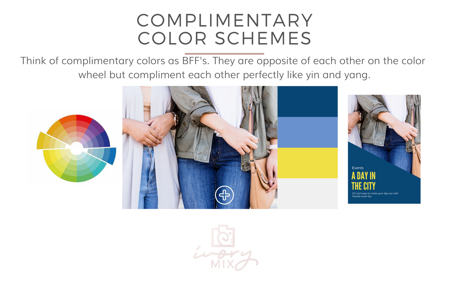
2. Complimentary (best friends)
Complimentary color schemes are made up of two colors that are opposite each other on the color wheel. Think of them like best friends or the yin to your yang. This color scheme is popular for branding because it feels good when things compliment each other.
Stock Photo Tip for Monochromatic and complementary brands!
Now that you know what monochromatic and complimentary color palettes are, you can use this knowledge to pair photos with your brand. For instance, if you have a monochromatic brand palette, consider photos that have a complimentary color (opposite of the color wheel).
See below for an example of how that is done using a photo that contains no blue with a monochromatic blue brand.
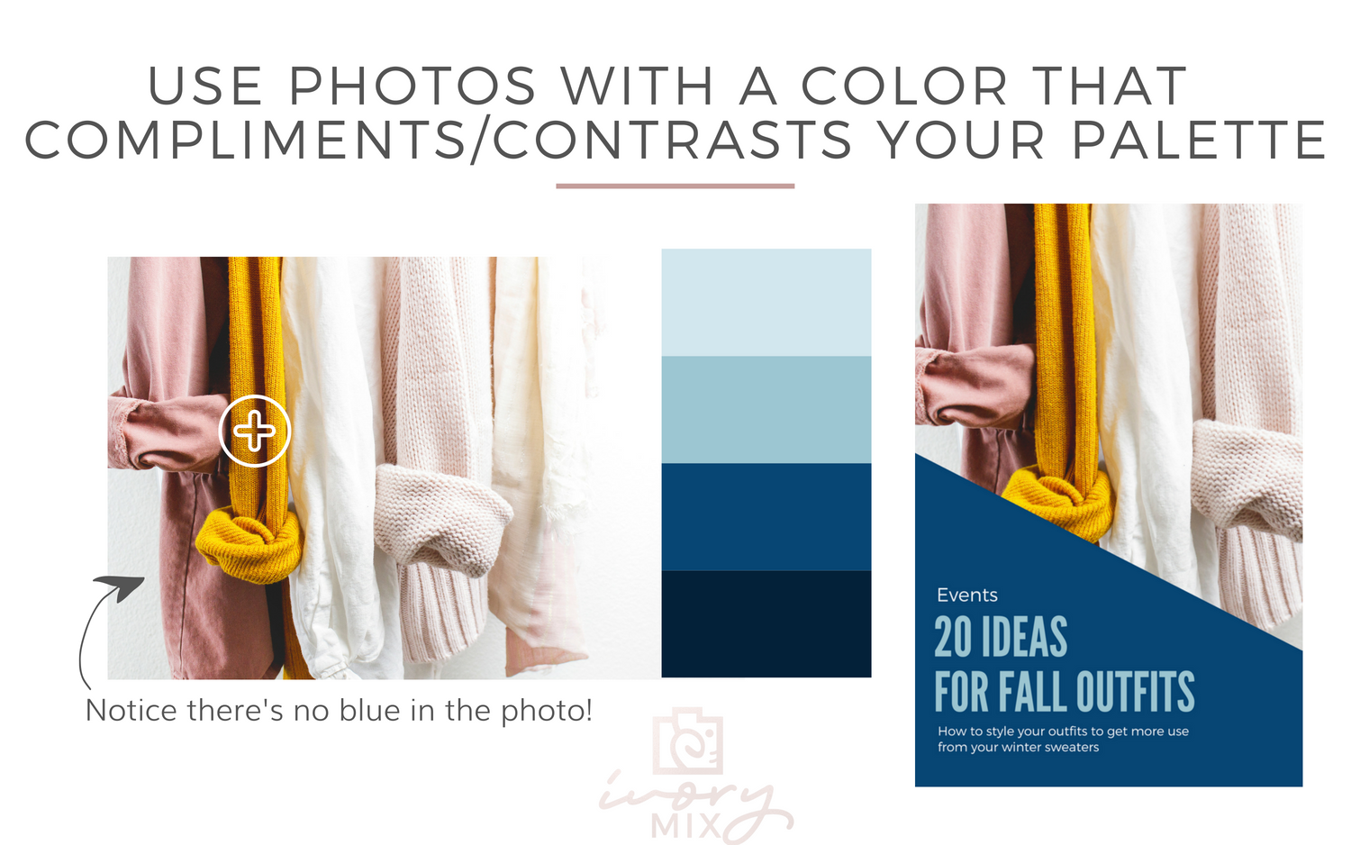
Keep a look out for that one color you know compliments your brand and if it’s paired with neutrals, all the better!

You can use this Color Wheel – Color Calculator to input your HEX branding color codes to find what colors compliment your brand.
3. Triadic Color Schemes (like a small tribe)
A triadic color scheme features three colors that are equally separated from each other on the color wheel. This combo is not as common and tends to be the toughest color palette for branding because they can become busy and fast. If you have a triadic color scheme, you probably know what I mean.
The way to find success with a triadic color scheme is to make one color more dominant and use the others as accents.
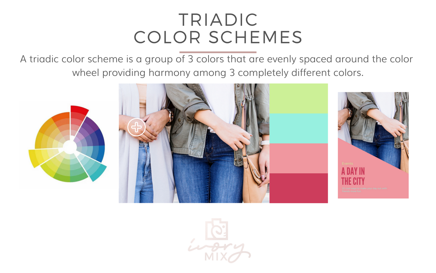
Stock Photo Tip for Triadic Color Schemes!
Remember that a photo doesn’t have to contain all (or any) of your brand colors. It just has to compliment them. If this seems more difficult than it looks, consider using photos that contain only one (or two) of your brand’s colors.
Notice in this example below that the photo contains zero red, but the brand palette has red in it and it happens to be the dominant color too!
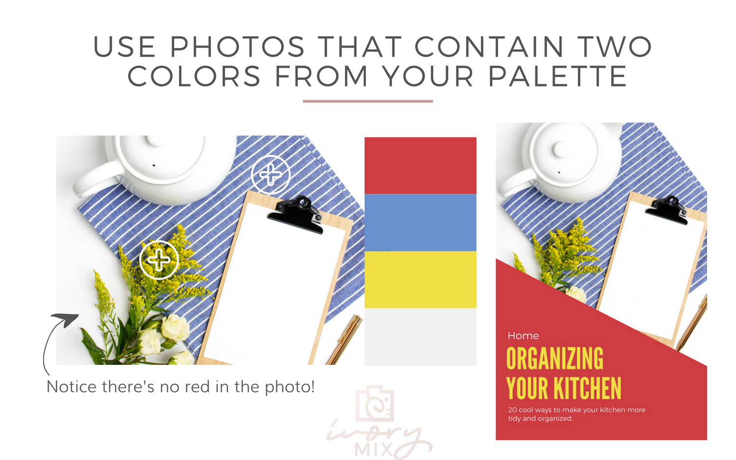
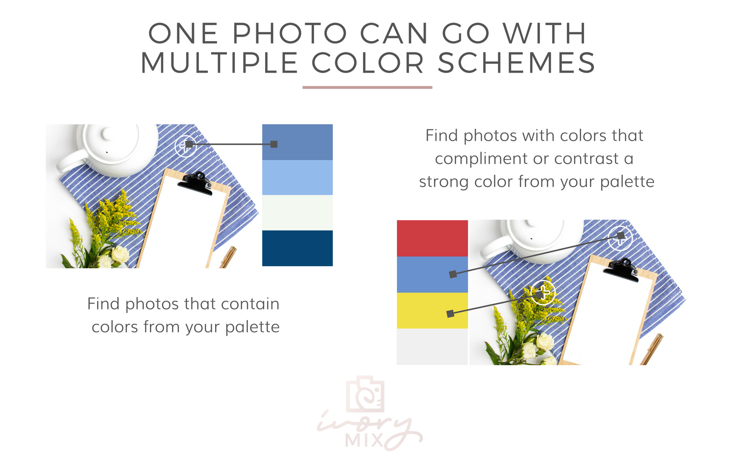
When playing with photos and your brand, it’s important to learn and remember what colors compliment your branding color palette, because one photo can usually go with multiple color schemes. It’s your job to become an expert at recognizing when photos contain complimenting colors.
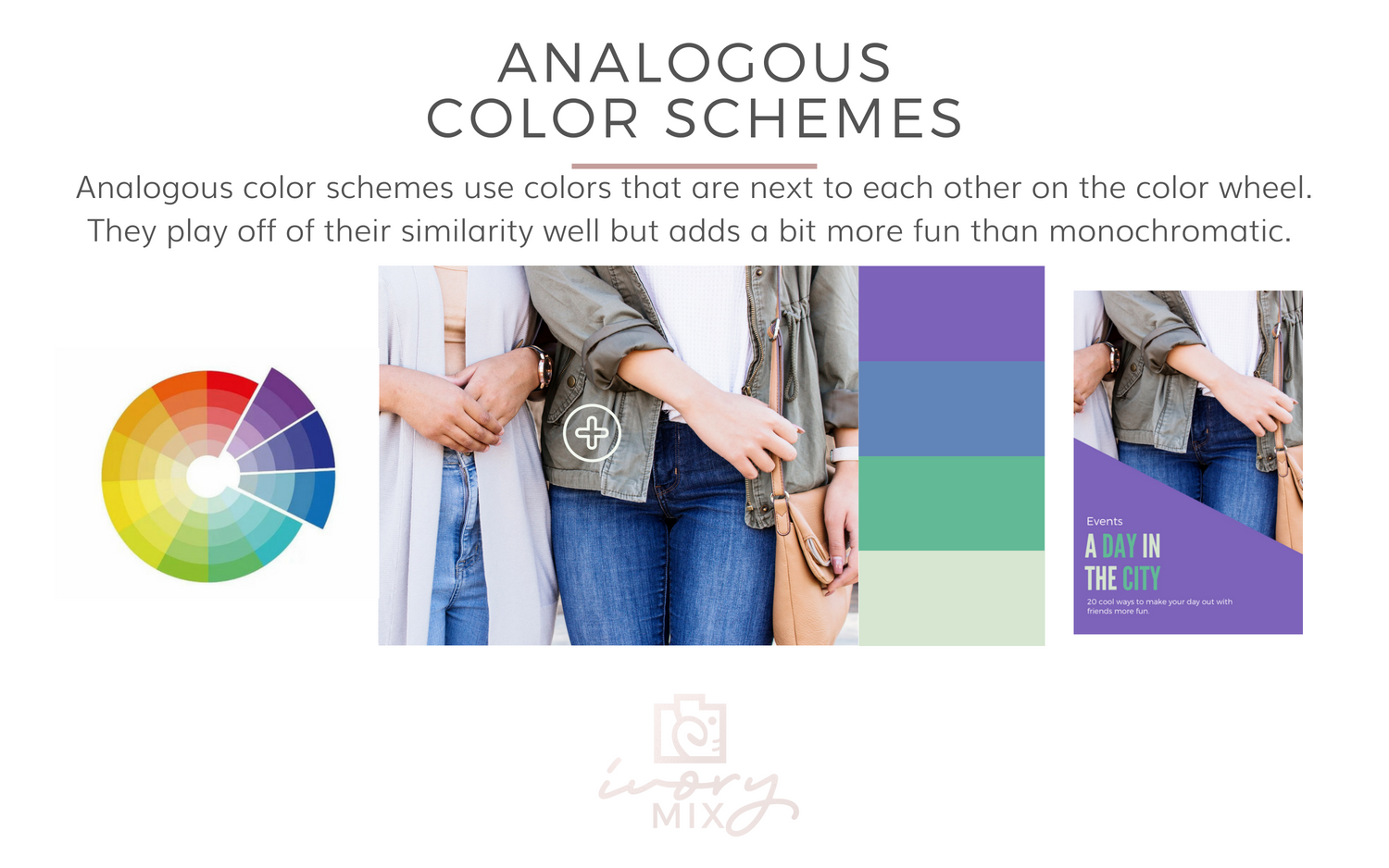
4. Analogous Color Schemes (their like family, but more like cousins)
An analogous color scheme contains colors that are next to each other on the color wheel. Like family and cousins usually do, this color scheme will usually share either quality. As an example, this color scheme contains colors with “cooler” qualities. All of the same stock photo tips give so far apply to this color scheme too.
5. Neutral with a “pop” color scheme
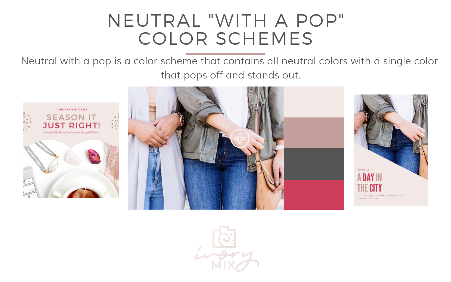
Neutral with a “pop” is a color scheme that contains all neutral colors with a single color that pops off and stands out among the others.
Stock Photo Tip!
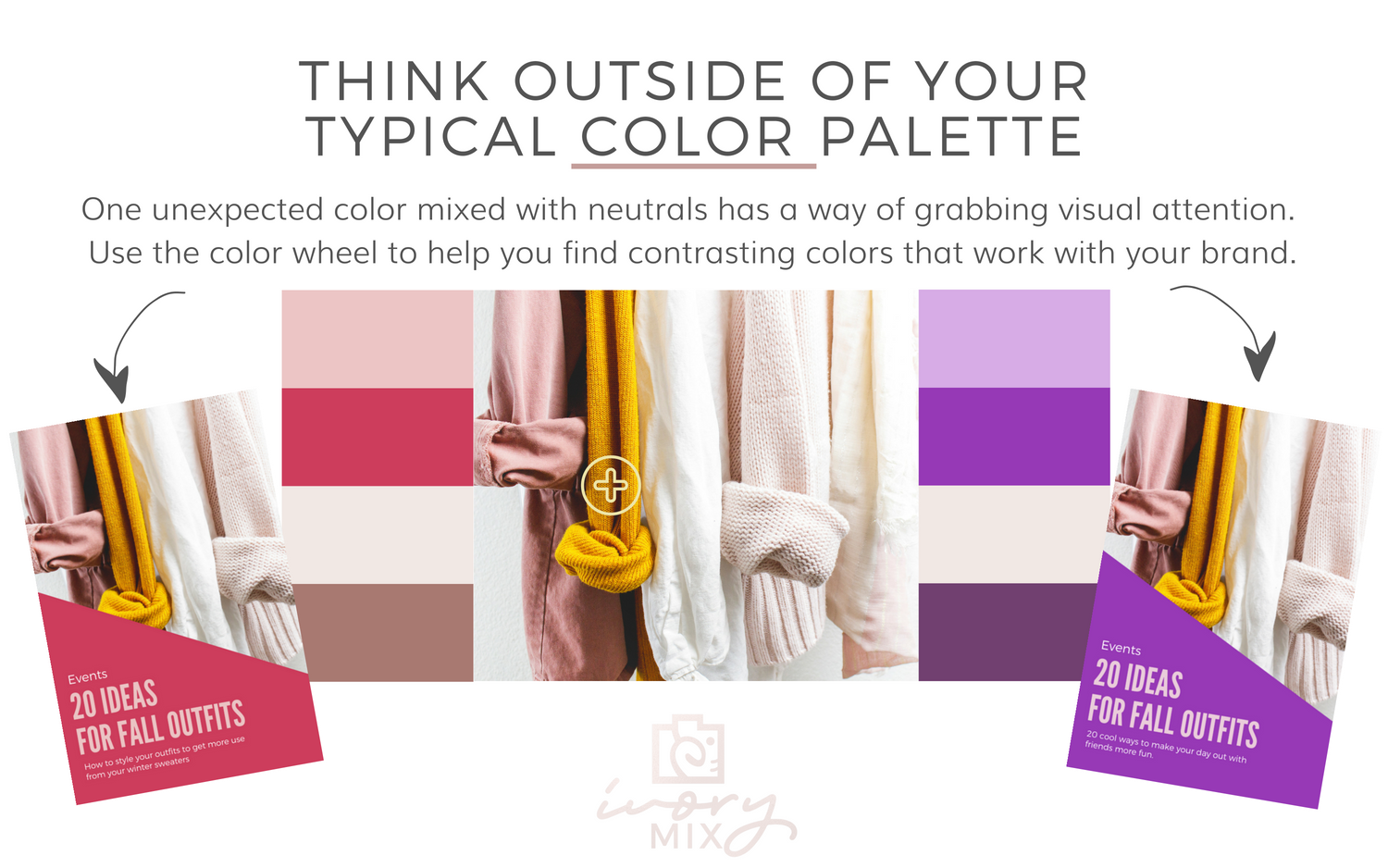
Think outside of your typical color scheme and brand palette by using an unexpected color mixed with your brand to grab visual attention.
Using the color wheel and what you’ve learned here by reading the above, you should be able to find colors that compliment your existing brand. Knowing what colors also work with your branding will open up your world of options, making branding and creating more fun!
How to Apply These Ideas to Stock Photos going forward.
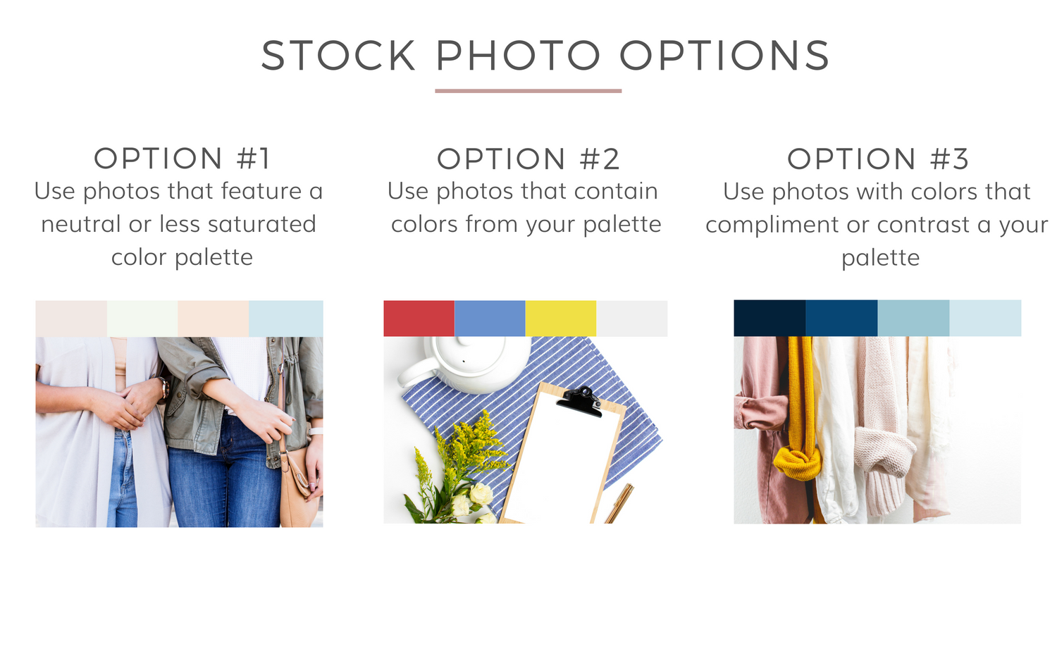
When thinking about photos to use for your brand, you can use these three options to guide your choices:
Option #1: Use photos that feature a neutral or less saturated color palette.
Option #2: Use photos that contain one or more colors from your palette.
Option #3: Use photos with colors that compliment or contrast your palette.
Now that you have a better understanding of the science of color, you can start to see how many photos can work for your brand and use the knowledge in your projects going forward.
Ready to get started?
Click here to browse our collections of styled stock photos and graphics.
Be sure to check out the affordable membership where I deliver over 100 stock photos every month in various color schemes and niches.
LOOKING FOR MORE BRANDING TIPS AND COLOR PALETTES?
Check out these other related blog posts and tools for branding:
How to create a colorful month of Instagram Content in 5 minutes.
30 Instagram post ideas when you don’t have a plan
Color Wheel – Color Calculator
Super Fast Color Schemes Generator
How to get branding consistency using stock photos
PIN IT FOR REFERENCE LATER:


Included Free:
550+ Templates, Photos, & Strategies
Get New Free Downloads Monthly
Unlimited Downloads
Special offers & Trends Newsletter
Save and sort your favorites
Access 500+ Free Templates, Photos, & Strategies With A Free Account
Free User Creation for Popup
By creating an account, I agree to Ivory Mix's Website terms, Privacy Policy and Licensing Terms
Already have an account? Log in
1 Comment
Leave a Comment
You must be logged in to post a comment.





What a great post! There are so many ways that I didn’t even think about using to change up stock photos – love the overlays! Thanks so much!