get 500+ free images, templates & marketing strategies! You're one click away, Don't Miss It.
How to Create A Sales Page That Sells
This post may contain affiliate links. Please read the disclaimer
Does the thought of creating a sales page for your next product launch leave you in a state of panic?
If so, you’re in good company. Sales pages have a lot of components, and entrepreneurs can easily become overwhelmed with all of the details. Plus, it can be downright intimidating to put yourself out there and pitch your product to the world!
I’m here to tell you that creating a sales page doesn’t have to be scary. In this post, I’m sharing an easy blueprint with all the elements your sales page needs to connect with your readers and capture the sale.
First, the basics. A sales page is a stand-alone landing page with a specific purpose — to convert visitors into paying customers. Sales pages are a crucial part of your sales funnel.
You may need a sales page if you’re
- Launching a course
- Enrolling people in a membership
- Starting a coaching program
- Launching a mastermind
- Selling packages for your 1:1 services
Elements of a Killer Sales Page
There are two components to your sales page that are equally important: copy and design. Your sales copy turns your product into a story, and your design organizes that story into a journey for the reader.
When you nail the combination of a killer design layout with sales copy that seals the deal, your page will have the magic formula it needs to convert visitors to customers.
Sales Page Structure and Design
The design of your sales page needs to be simple and intentional. Its purpose is clear — to make a sale. A simple design that isn’t overly complicated or full of fluff works best. You don’t want to distract from your message with too many design elements or unnecessary additions.
- Use sections to break up your text and add interest
- Mix large, captivating headlines and subheadlines with blocks of smaller text
- Use images and videos to capture attention and build interest
- Create buttons for your calls-to-action
- Incorporate white space in your design to give reader’s mind a place to “rest”
- Throw in some bullet points, bold, and italics to break up the monotony
- Make sure there is no top bar navigation (home, blog, podcast etc) links on your page. Your sales page needs to be a stand-alone page with no way for users to get distracted by other content. You want your potential buyers focus to only be on the sales page.
*Top tip: Make sure your sales page is mobile-friendly. You should expect the majority of visitors to scroll over your page using their mobile device, so don’t pour hours into beautiful sales pages only to discover that it looks like a jumbled mess on your phone.
Sales Page Copy
We all love to throw clever sayings and jargon into our content here and there, but a sales page isn’t the place. Sales page copy should be clear and direct.
In your copy, clearly communicate what the product is, how it will help your reader, what the value of the product is, and who the product is right for.
Present all of this clearly and honestly. Readers should know and understand exactly what they’re getting, and even more importantly, how the features of the product will benefit them. Your readers are more interested in the benefits and results of your offering than what’s included in the package. Be sure to focus on the solution you provide to their problem.
Top Tip: Be sure to infuse storytelling into your sales pages. Give examples of times in YOUR business where YOU experienced the same problems and how you overcame this. Readers want to know that someone else has had the same problems as them, how they overcame this problem, and what your lifestyle/ business is like now (having solved the problem).
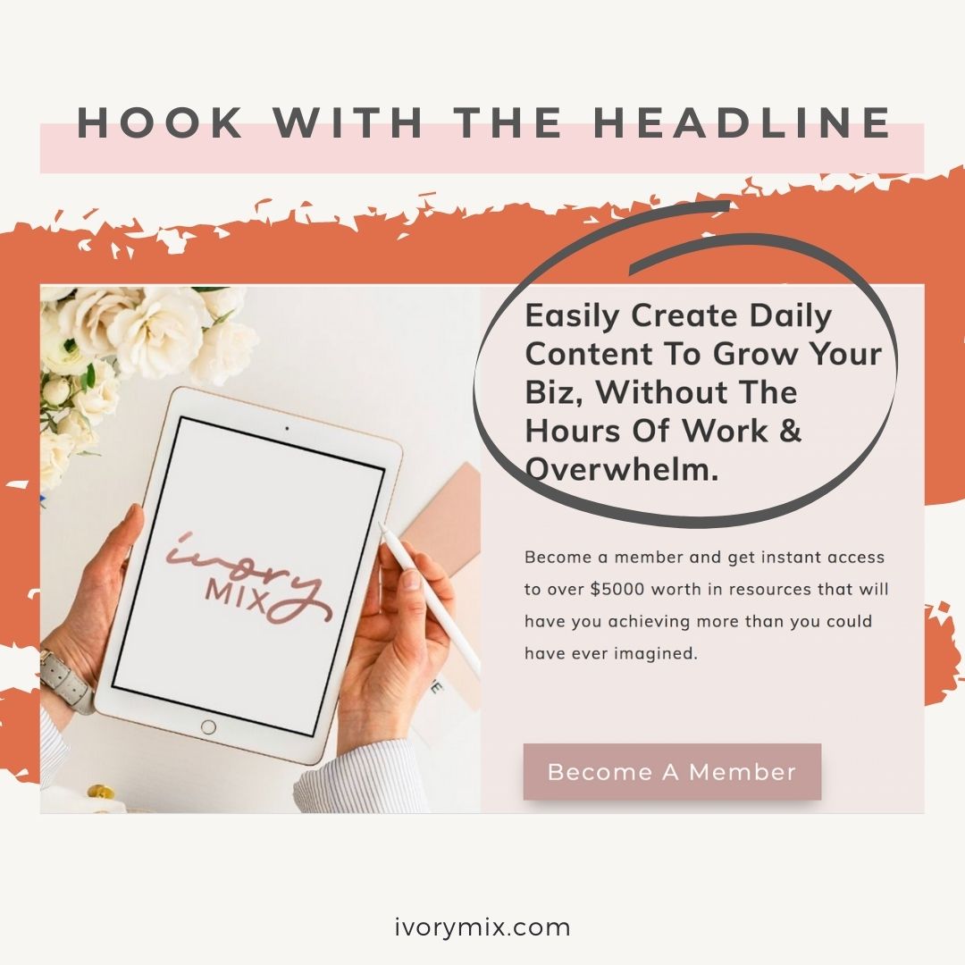
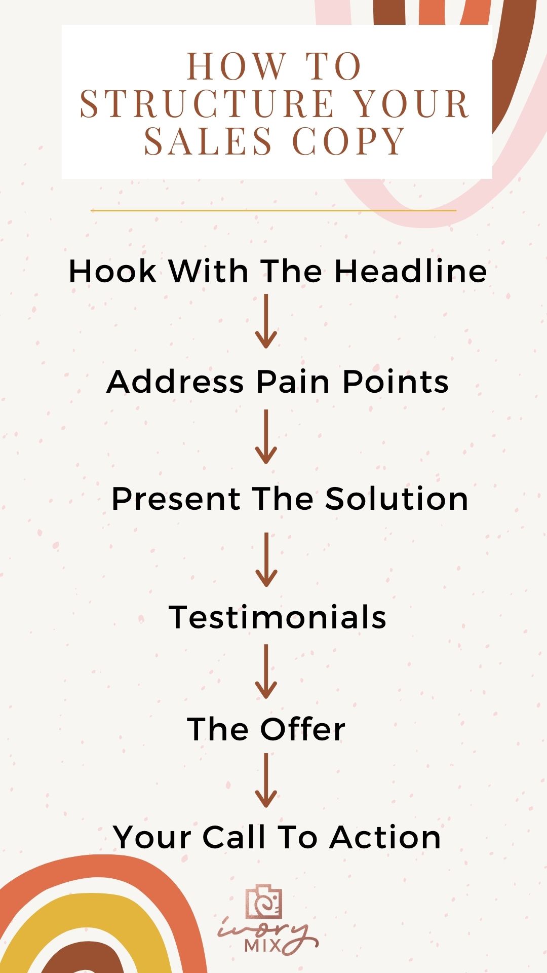
Hook with the headline
Headlines aren’t just important for emails and blog posts, they’re one of the most important elements of your sales page. An eye-catching headline grabs the reader’s attention and convinces them to continue consuming the content.
A good headline will create anticipation and make the reader excited to learn more about the product.
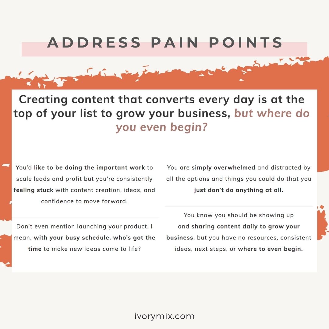
Address Pain Points
After the headline, jump right into addressing your ideal client’s most pressing need. A sales page must speak directly to your ideal client by relating to their struggles and offering your product as a clear solution.
To create copy that connects and converts into sales, you must get inside their minds and discover their:
- Biggest challenges
- Most frustrating struggles
- Worst fears
- Ways they’ve already attempted to fix the problem but failed
- Hesitancies
Once you’ve pinpointed these pain points, show your readers you relate to their struggles — that you get where they’re coming from. Remember to infuse storytelling to really capture your audience’s attention.
- “I get it.”
- “I’ve been there.”
- “I’ve seen it happen again and again.”
- “I feel your pain.”
- “I’ve said it a million times myself.”
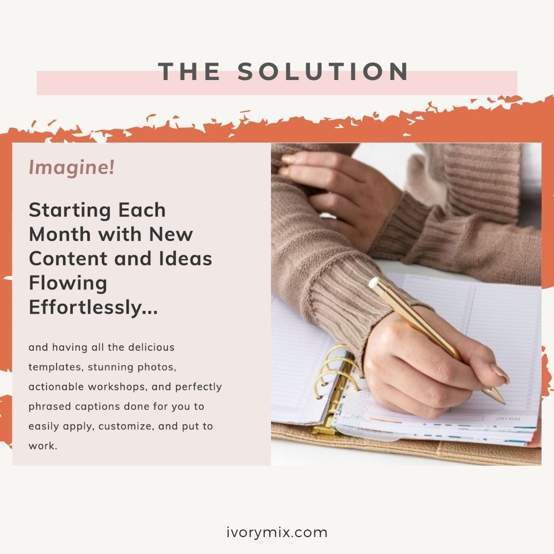
Present the Solution
After you’ve connected with the reader and empathized with their pain, it’s time to present your product as the solution — the answer to their prayers.
Describe for them in detail how their lives could be different after purchasing your product.
Paint the picture of what their business or life could be like after they have purchased your course/ product/ offer. Paint the picture of what their business or life could be like after they have purchased your course/ product/ offer. Always have in your mind ‘what’s in it for them?’ when writing your solution.
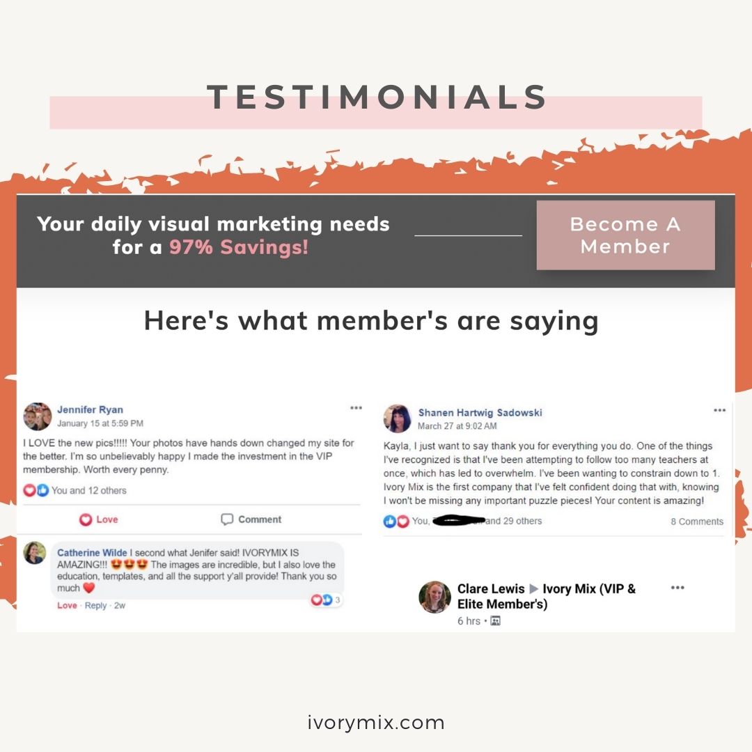
Testimonials
Did you know that 90% of consumers will only purchase from companies who have built trust with them? Your sales page is the place to build that trust and prove your product actually works.
The best way to do that? One word: testimonials.
People are desperate to hear honest experiences from former customers before they buy a product, so don’t hold back. This is the time to brag.
Make sure to share several success stories, at least 3-5 is a good number to shoot for. Be sure to include specific results as possible!
Top Tip: If you can include both video and written testimonials, this will help your audience connect with your previous client’s results. Video is a powerful way to tell a transformational story about your service/ offering.
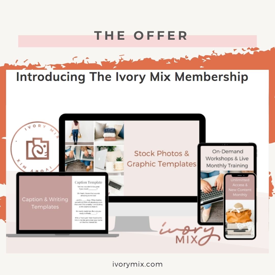
The Offer
This is where it all comes together — it’s time to make your reader an offer they simply can’t refuse!
Some clever pricing strategies to try include:
- Offering clearly described, limited-time bonuses to create urgency
- Offering more than one option at different price points
- Labelling price points with descriptive, memorable names
- Highlighting the “best option” if there’s one you really want them to buy.
- Ending all prices with the number 9 or a 7 for lower-priced and more ‘spontaneous purchases’, and rounded pricing like $2,000 for more high ticket items.
Your Call to Action
It’s decision time for your reader, and you want to make the choice to click and purchase as easy as possible.
When it comes to effective calls-to-action, we have to move beyond the boring “Buy Now” button — these are overused and don’t create a sense of urgency.
Instead, get creative. Learn what calls to action work best with your specific audience. Try fun options like “I’m in!” “I’m ready to enrol,” “Sign me up!” or “I’m ready for change.”

Included Free:
550+ Templates, Photos, & Strategies
Get New Free Downloads Monthly
Unlimited Downloads
Special offers & Trends Newsletter
Save and sort your favorites
Access 500+ Free Templates, Photos, & Strategies With A Free Account
Free User Creation for Popup
By creating an account, I agree to Ivory Mix's Website terms, Privacy Policy and Licensing Terms
Already have an account? Log in
1 Comment
Leave a Comment
You must be logged in to post a comment.






Kayla, I am so glad I took everyone’s advice about Ivory Mix. Your photos are beautiful, your advice is detailed and spot on. I’m really glad to be in the club of people you help. This topic today answers several questions I have right now. All that to say an honest “Thank you!”