get 500+ free images, templates & marketing strategies! You're one click away, Don't Miss It.

Included Free:
550+ Templates, Photos, & Strategies
Get New Free Downloads Monthly
Unlimited Downloads
Special offers & Trends Newsletter
Save and sort your favorites
Access 500+ Free Templates, Photos, & Strategies With A Free Account
Free User Creation for Popup
By creating an account, I agree to Ivory Mix's Website terms, Privacy Policy and Licensing Terms
Already have an account? Log in
Stop making these design mistakes on Canva
This post may contain affiliate links. Please read the disclaimer
If you’ve been wanting to feel more confident in your graphic design skills using Canva, especially if you’re a beginner, this blog post is for you.
I’m going to walk you through some simple things that can help make sure that your designs look good.
You can skip the read and watch the video here:
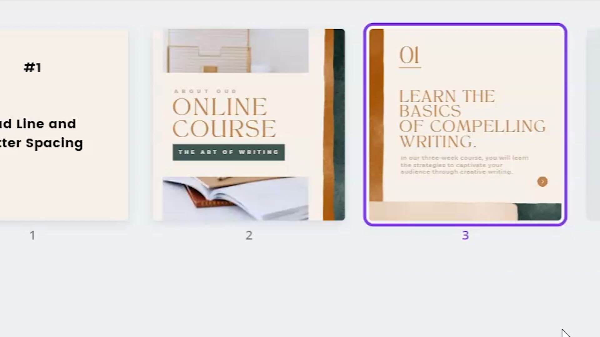
Mistake #1 Bad Line and Letter Spacing
The first design mistake that I often see is bad line spacing or bad letter spacing. Let’s take a look at a couple of examples:
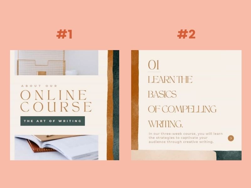
These used the same fonts and the same colors, which is great, however the spacing between the sentences in the second design and the spacing between the letters in the first design are not the same.
If you were going to post these designs next to each other on Instagram or on your blog or website, something would stand out about them, even if they’re the same fonts, same colors and same branding.
The spacing between the letters and the lines is a little off. We have to keep it consistent between the different designs that you’re creating so that you can create consistency within the brand. That consistency is even more than just the colors or the fonts.
On Canva, you can go to “spacing” and you can change the letter spacing and the line spacing.
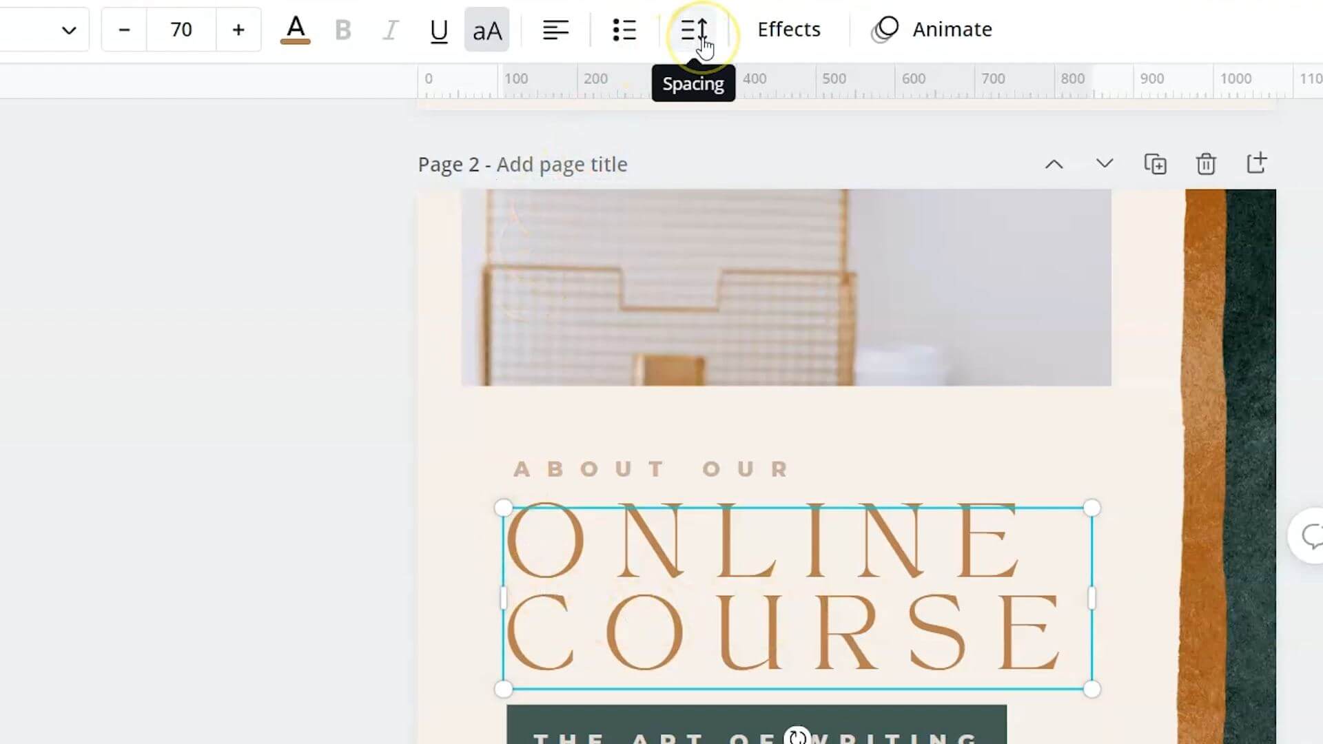
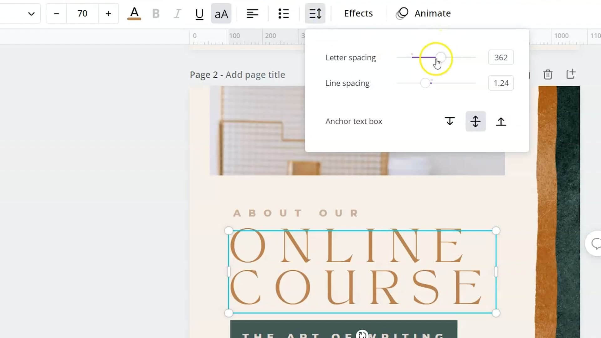
You can click on this format tool, and you can format all of your fonts the same way. The spacing of the letters and the lines will remain the same, despite the size of the font.

When you look at the two designs next to each other, they are more consistent and design wise look better together.
Mistake #2 Misaligned text, elements or bullet points
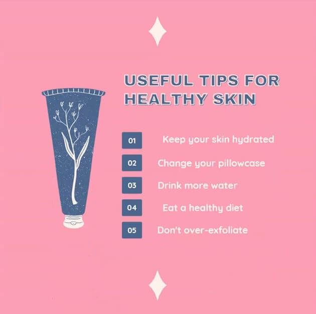
The second most common mistake that I see happening on designs and templates is misaligned text elements or bullet points.
Canva has some pretty neat Built-In features to help you create more balanced designs. One of those happens to be the ability to align your text and elements.
I have this template that I’ve pulled up, and you can see that these items on this list are not evenly lined up with each other.
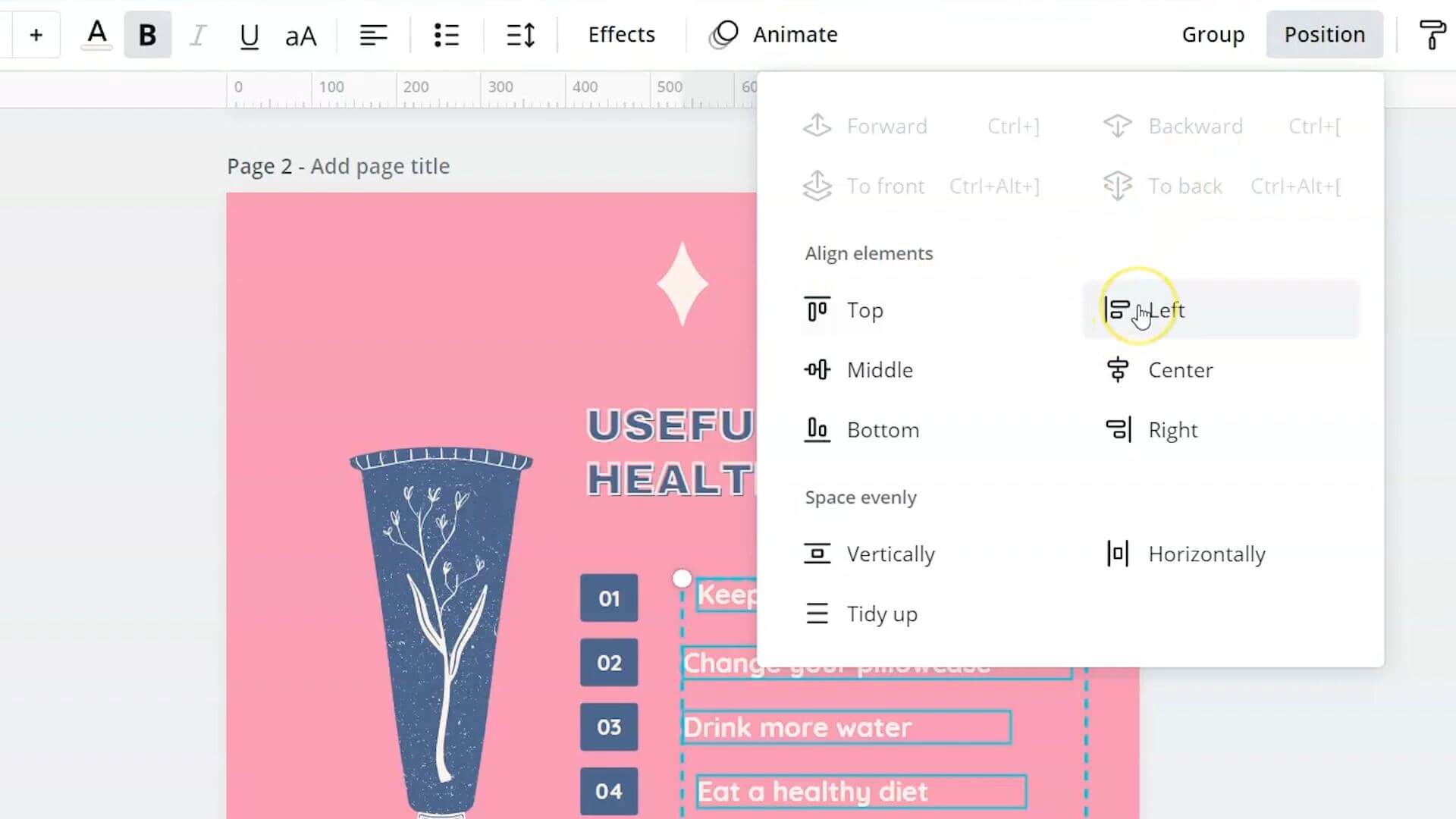
You can select each of these lines and go to position right at the top and click on these align elements and line all of the elements that are selected to the left. There are lots of different ways to either space out your elements evenly or align them so that they’re more balanced but in this particular instance, aligning everything to the left was the best.
By doing that, we’ve now taken all of these lines and we’ve aligned them all to the left. It looks clean, well-balanced and a better design in general.
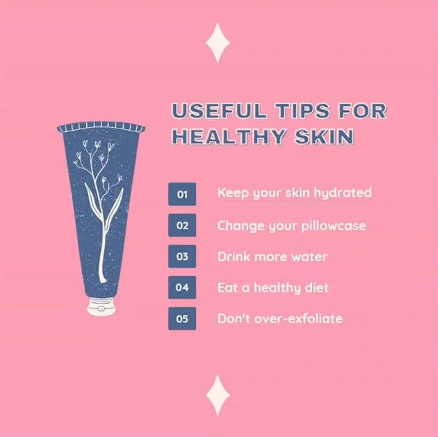
That’s one of the most common things that can be fixed with a simple click.
Mistake #3 Bad Font Choices
The third common mistake that I see in graphic design or designs on Canva is bad or poor font choices.
When it comes to your brand, you’ve probably got some fonts that you’ve decided work really well for your brand and you’re using those fights on your graphics, your website and everywhere that your audience interacts with you.
However, in certain instances, we want to be careful not to use certain fonts when we’re trying to portray certain emotions or feelings.
For instance, I’ve pulled up this template on Canva and it says, “let yourself bloom like a flower,” utilizing this flowing handwritten font to go with this floral concept.
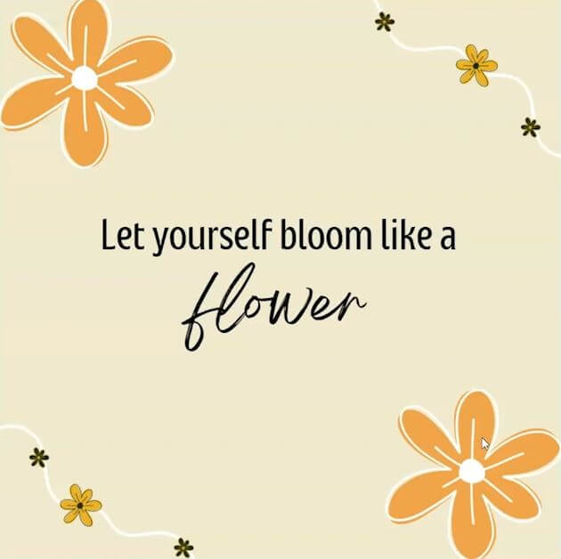
If your brand was using something other than this font, it might not portray the right message. We have to be careful to utilize our fonts where it makes sense and when the message matches our font.
In this case, this inspirational quote is a little more delicate. Using something a little more masculine to portray this message probably wouldn’t work.
This font, for instance, is a glitchy font. It’s probably a little better used for a tech company of some kind, but not necessarily this message.
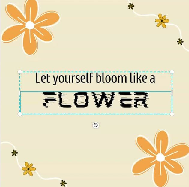
We want to be careful that our fonts match the message and that in instances where another font might be better suited for the message, we might want to consider that.
I’m not saying change your fonts every time you have a different message, however, do take into consideration the message is being portrayed properly through the fonts that you are using.
Mistake #4 Creating Content That You Like vs. what you know your audience likes
One of the biggest, most common mistakes I see content creators make is creating content that they like versus the content they know their audience likes.
This is a huge mistake because you’re leaving a lot on the table. You could be reaching more people if you created more content that your audience likes versus trying to continually create content that you like, because, let’s be honest, your content isn’t for you. If you’re a small business owner, your content is for your audience.
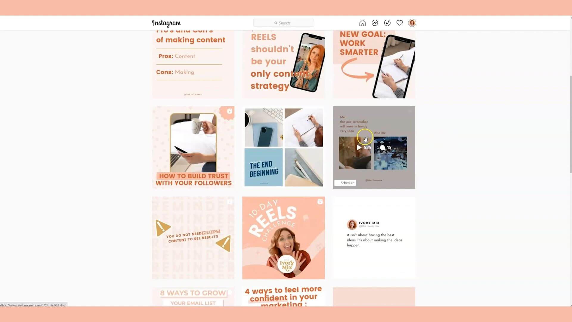
The way that I approach this is I go to my Instagram account, and I look through my posts and I look at what gets the most reach, what gets the most comments, and what gets the most saves and shares.
I know that that content is what is really keeping my audience excited and what they’re really enjoying.
The things that they don’t like, share, or comment on often times are things that I thought was going to be funny or I thought was great content.
If your audience isn’t responding as well to that content, then you should stop creating it.
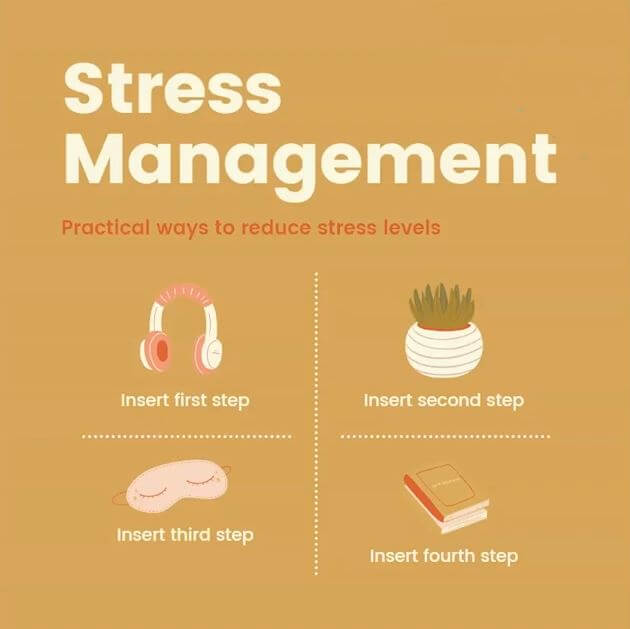
Mistake #5 Too Many Elements (less is more)
The fifth most common mistake that I see made on designs is that there are too many elements in a lot of cases. Less is more.
If you’ve been playing with templates and adding in illustrations and animations, it might be time to take a look at your design and see if you could take a few things away.
This is one of the most common mistakes.
For example, I have this template that shows practical ways that you can reduce your stress levels.
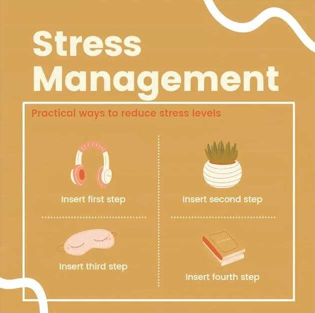
With a simple removal of a few extra design elements we’ve brought the focus back to what the content is about and streamline the design so that it’s less cluttered and more focused. It’s easier to read and it’s actually more pleasurable to read. In this case, less is more.
Mistake #7 Using Incorrect Hierarchy (focal point)
The seventh most common thing that I see done incorrectly in designs on Canva is using the incorrect hierarchy. What that means is using the incorrect focal point.
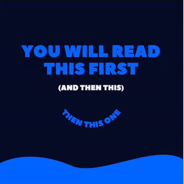
This is actually a very in-depth topic, but it comes with a very basic sentiment: draw attention to the thing you want people to see first.
When you look at these designs, what is the thing that you looked at first?
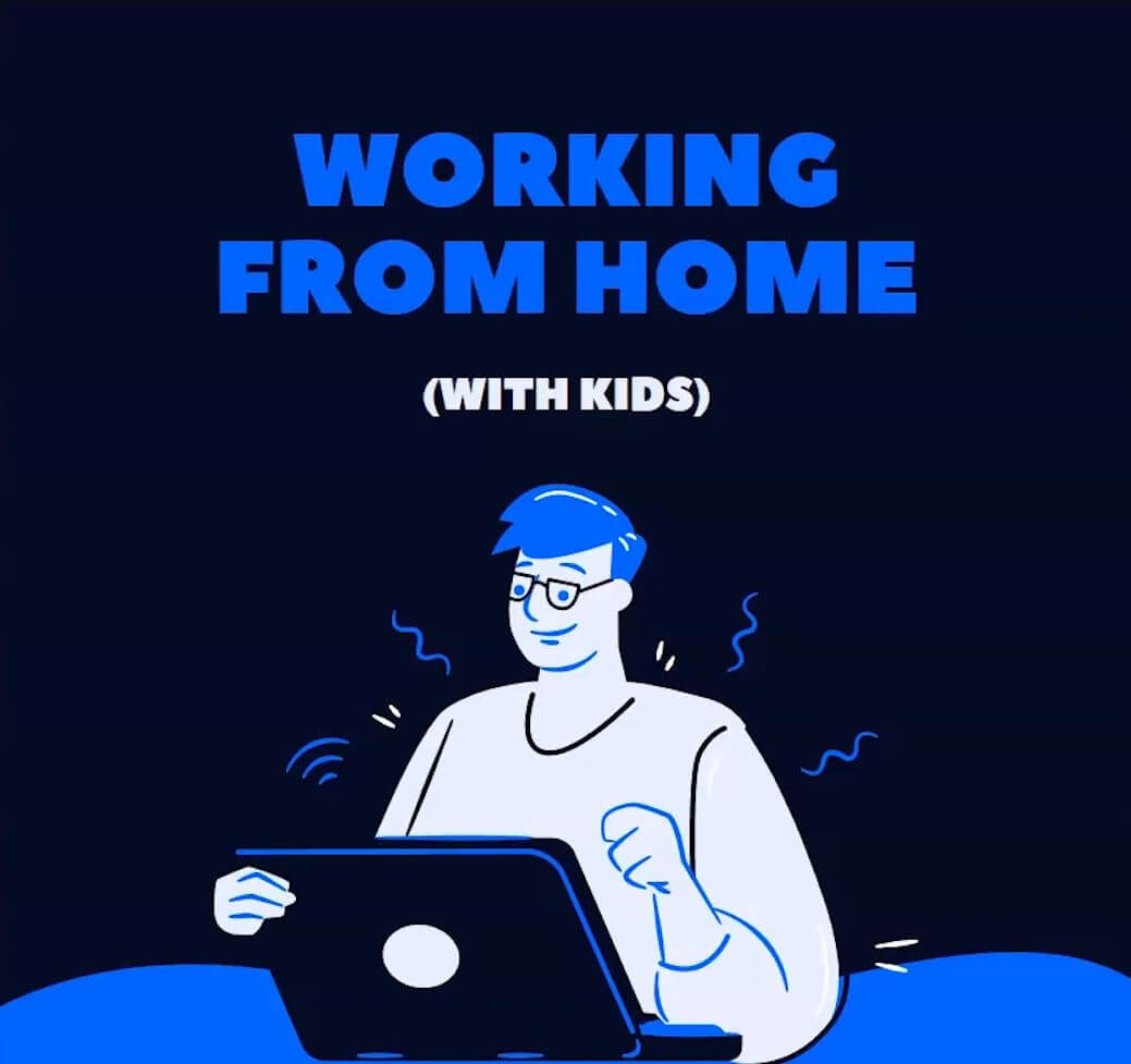
What is the first thing that you read?
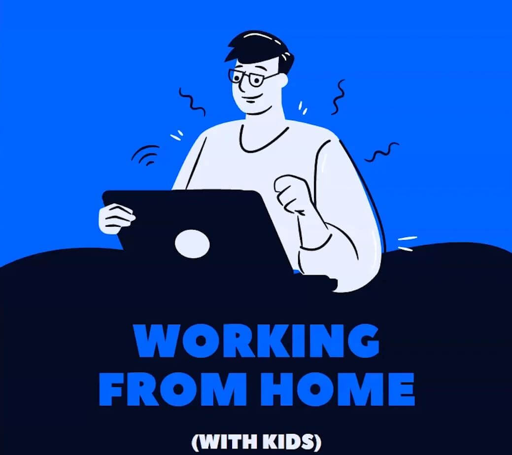
What is the first thing that you looked at when you compare the two?
I am certain that on the first design, your eyes were drawn to the words “working from home” first. On the second design, your eyes were drawn to the drawing of the man or woman behind the computer.
There’s a reason for that. It has to do with color and contrast, as well as positioning within the design itself.
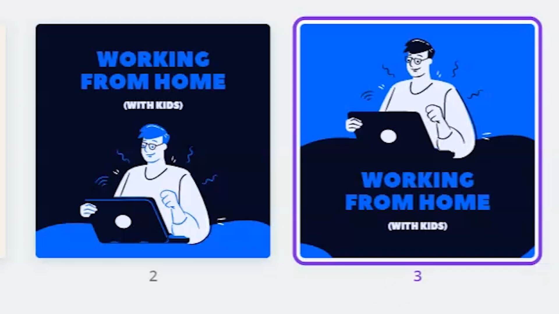
When you are wanting to draw attention to specific words, first, you want to make sure that you’re designing around that focal point.
The best way that I could describe this is in this fashion:
This has to do with not only the position of the text, but also the color of the text and the size of the text or the size of the element.
Make sure that when you’re doing designs, that you’re paying attention to what the hierarchy is of the items you are putting in your design and what you want people to focus on first.
If an image or an illustration is not what you want people to focus on first, then you’ll definitely want to flip that design and flip that focus.
That’s part of the reason why on Pinterest, I often create Pinterest pins with the text at the top and the image or illustration at the bottom, because I want the attention to go to the text first and then the image as a supporting act to the text.
Now that you know more, I have one last tip for you, and that is that you can get your hands on free Canva templates and exclusive stock photos plus more strategies exclusive to the Ivory Mix community. There’s up to five hundred resources here for you.
Let me know what your favorite part was and share this post with your fellow content creators. If you do share it to Instagram stories, be sure to tag me so that I see it, because I may just feature you in my Instagram stories.
What Next?
Want to learn more about Canva? Click below to learn more from our latest articles.
Included Free:
550+ Templates, Photos, & Strategies
Get New Free Downloads Monthly
Unlimited Downloads
Special offers & Trends Newsletter
Save and sort your favorites
Access 500+ Free Templates, Photos, & Strategies With A Free Account
Free User Creation for Popup
By creating an account, I agree to Ivory Mix's Website terms, Privacy Policy and Licensing Terms
Already have an account? Log in
 (1)")

