get 500+ free images, templates & marketing strategies! You're one click away, Don't Miss It.
Avoid These Branding Mistakes That Might be Costing You Money
This post may contain affiliate links. Please read the disclaimer

Why is branding important anyway? When it comes to maximizing your revenue, income, and establishing a strong presence within your niche, you absolutely need to build a unique and recognized brand that aligns with a clear and direct brand message. A brand that can establish a clear and unique selling position and voice in your niche will stand tall above the rest. Far too many new brands don’t take enough time to think their brand through, causing unnecessary mistakes that could easily be avoided.
If you want to make this year your best yet, then let’s take some time to audit your brand and see what mistakes you could be making, shall we?
Inconsistent designs / Constantly Changing
I’m guilty of doing this for nearly the entire first year of owning this website. Instead of constantly tweaking my brand, I could have been making products and sales. So, if you’re switching up your fonts and colors all the time, stop. Stop now. No, it doesn’t mean you’re doomed. It does, however, mean that over time, if you continue this, you’ll lose important and valuable long-term impact on your audience.
There’s something to say about brand’s that stay consistent and recognizable for years. Their audience tends to be more loyal and receptive to their marketing.
Copying your competitors’ brand
It can be tempting to copy the branding of a brand that has a large and engaged community and seems to be killing it. Your brand and business is unique to you and you’ll find that if you customize your brand for your needs and audience preferences, you’ll do a better job promoting something that reflects who you are through-and-through.
Trying to cover all bases (appeal to everyone)
Do you have a customer avatar? If you haven’t taken a moment to map out your ideal audience, then your messaging and branding may be too broad and not capturing the attention of the right people.
Example: A yoga studio owner has two ways that she markets to her audience. Through her Instagram account and on her blog. On Instagram one day, she decides to re-share an inspiration quote from the Instagram account of favorite yoga attire brand and on that same day over on her blog, she publishes an article about her Thanksgiving travel back home.
Not aligning your message across all platforms of branding and marketing is a misstep.
The fix would be to keep the Thanksgiving blog post on a personal blog or personal social media account and instead, write an article about her favorite yoga attire.
DIY-ing everything (including your logo)
Everything gets easier and easier to DIY these days. There are endless numbers of free and paid tools to help you DIY, but some things are better left to a professional that has a specialty. If you want to stand out, it’s probably a desire to stand out for the wrong reasons.
Don’t stand out because you tried to DIY something you had no business attempting. There are countless options and designers out there willing to take on the more difficult projects for you.
If all else fails, get yourself a template from Creative Market.
It doesn’t have to be a difficult or time-consuming process. No excuses!
Way too many fonts
Aren’t fonts fun? I am guilty of hoarding every swirly handwritten font I can find. Just because I like and hoard fonts, doesn’t mean I intend to use them in my brand. For me, I design digital products, so it makes sense. However, for the average brand, sticking to 2 or 3 fonts is ideal.
Pick your 2-3 fonts and look away from everything else! Like the other inconsistencies, this will help build brand recognition with your audience as well as streamline your overall design process.
One way you can avoid the use of too many colors and fonts are by making yourself a brand board that you use as your guide for everything. A brand board typically consists of your fonts, brand colors, images, and logos as seen here in this example below.
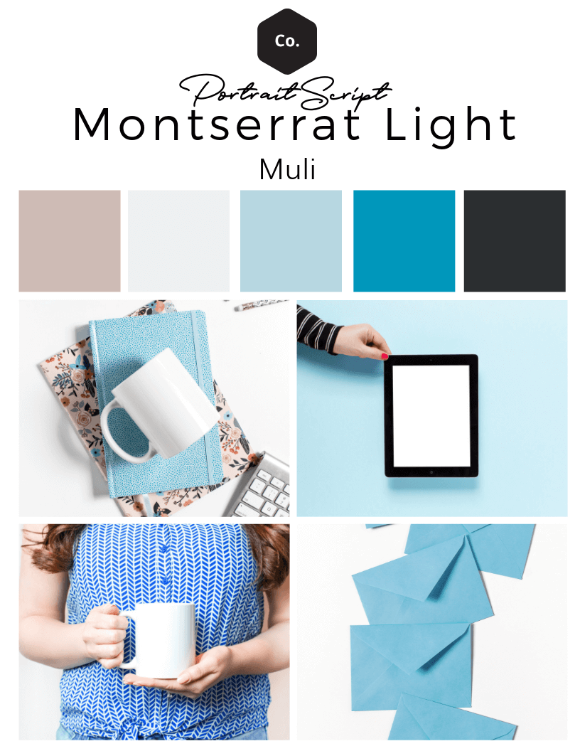
I created a video to show you how easy it is to create a brand board for yourself right inside of Canva for free.
Audit your brand
Enough with the mistakes. Now it’s time to start fixing up your brand. A great place to start is to download the complete guide to branding.
Additional Resources

Included Free:
550+ Templates, Photos, & Strategies
Get New Free Downloads Monthly
Unlimited Downloads
Special offers & Trends Newsletter
Save and sort your favorites
Access 500+ Free Templates, Photos, & Strategies With A Free Account
Free User Creation for Popup
By creating an account, I agree to Ivory Mix's Website terms, Privacy Policy and Licensing Terms
Already have an account? Log in


