get 500+ free images, templates & marketing strategies! You're one click away, Don't Miss It.
How to Create your website for FREE in Canva (pros and cons)
This post may contain affiliate links. Please read the disclaimer
One of the very interesting tools that Canva provides is the ability to create a website.
You can create a website on Canva for your brand, you can share it, and people can click on things. It’s your website, and you can create it for free.
I’m going to show you how you can do that today, but I’m also going to share with you why I like it and why I don’t. If you are interested in Canva websites and learning more about it, let’s get started.
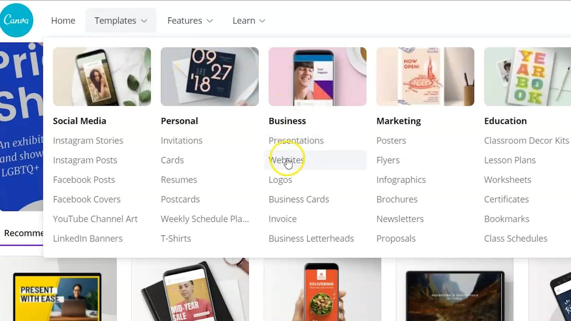
To get started creating a website using your free Canva account, you can go to templates, go to the business section and click on websites. This is going to pull up multiple different website templates.
Search Canva for a template
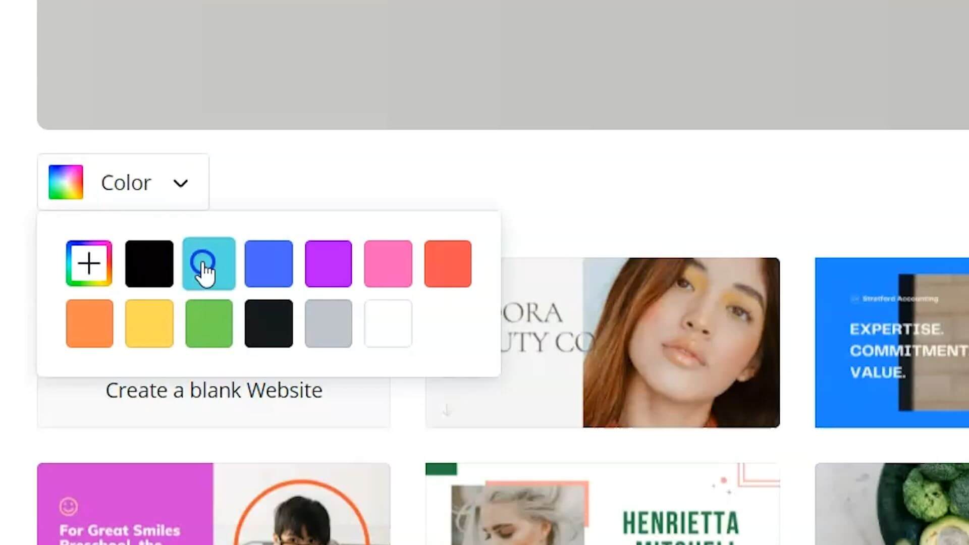
One of the nice things that I really love about Canva searchability is you can filter your search results for particular templates by color if you want to start with something that feels even more on brand right from the get-go.
I do want to mention that there’s actually a couple of different website types inside of Canva.
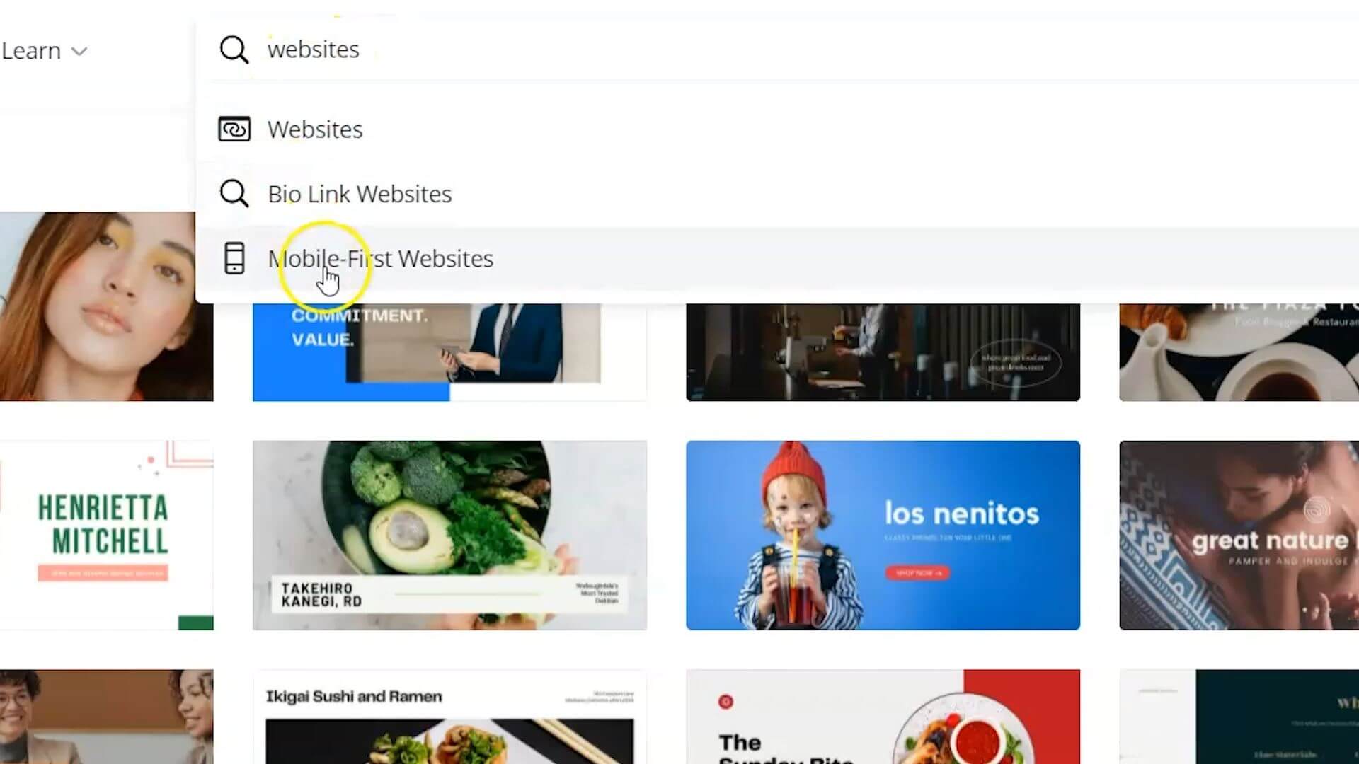
Choose a Mobile-first websites
You have these horizontal or made for desktop or laptop type of websites, and they also have mobile first websites. If you go to the search bar and click into the search, you can see you have this mobile first website.
That is probably where I would suggest starting because most people are going to be viewing your website on their phone more often than not, especially if you are going to be sending people from social media to your website.
I’ve picked this green and peach simple, wellness startup mobile first website, and there are 16 different slides as part of this website.
I’m going to create a website that sends people to my YouTube channel and my lead magnet landing page. I will only need maybe three or four of these and delete the rest.
To delete the rest, I’m going to highlight all of them by holding down the shift button on my keyboard and highlighting all the ones that I want to delete.
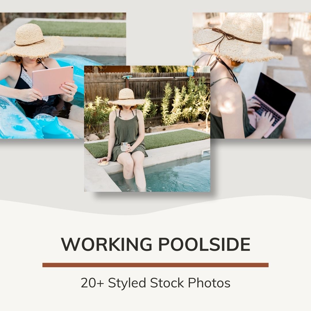
Now I’m ready to customize everything for my website. I’ve uploaded some stock photos from the Ivory Mix Membership.
Embed YouTube videos on your mobile website
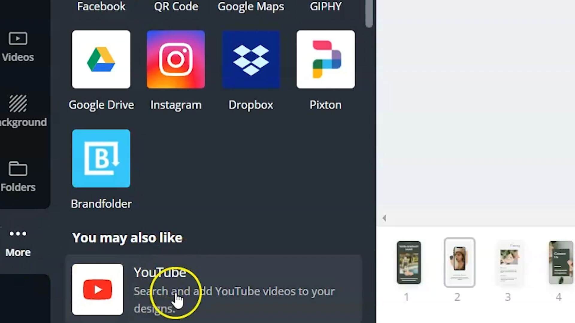
If you’re interested in adding your YouTube videos or channel to this Canva website template, you can actually go to more and add the YouTube extension to Canva.
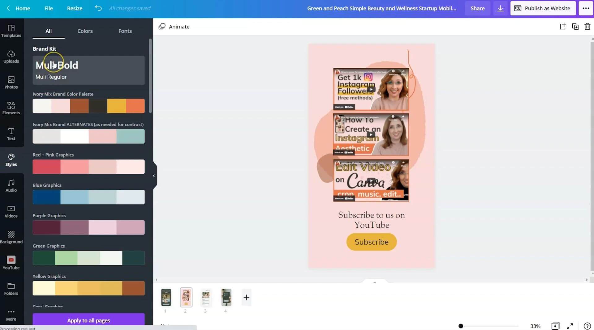
You can embed videos right on to the Canva website. I’ve typed in Ivory Mix and it’s pulled up a lot of my YouTube videos. I can actually embed these videos onto the template.
Now we want to add a call to action button. I’ve gone to elements and typed in “button,” and there are a few different shapes that I could use, but I definitely want one that I can change the color of. I will use this button and add some text over the top of that.
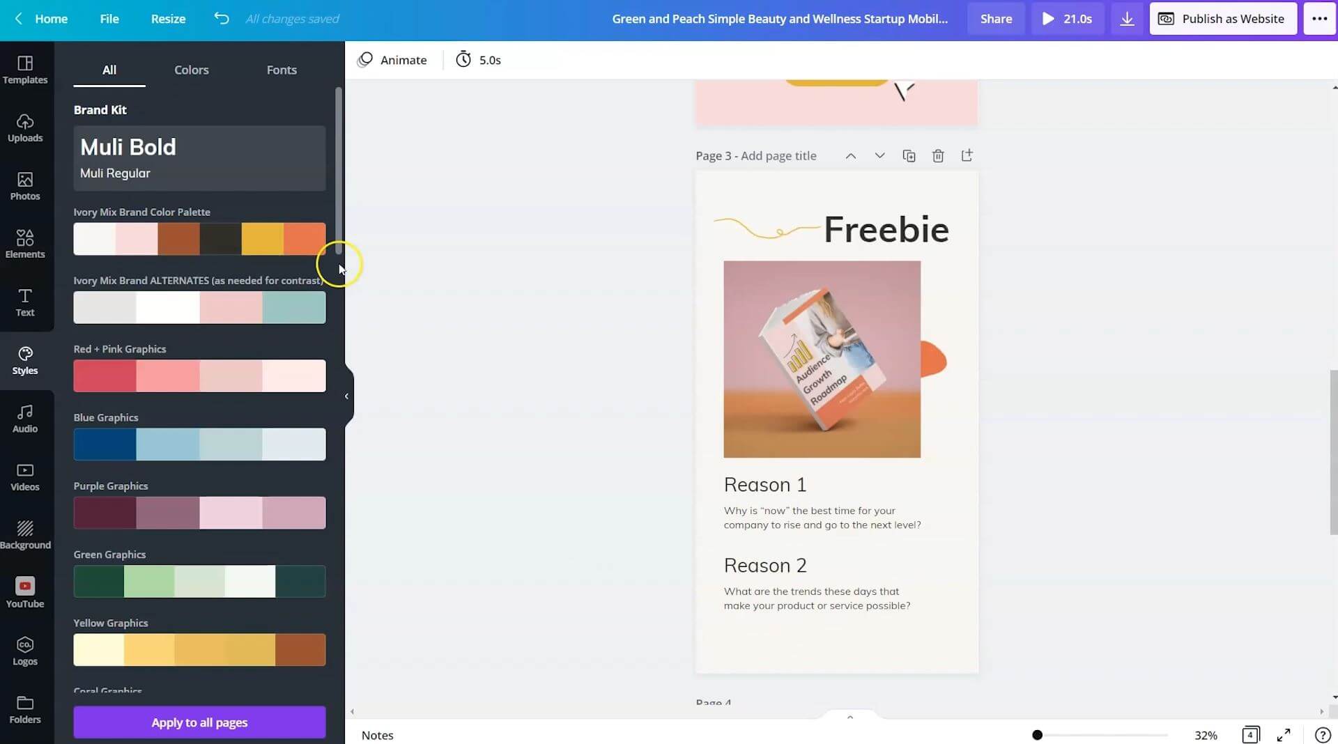
Use the Canva Brand Kit to quickly customize the free website
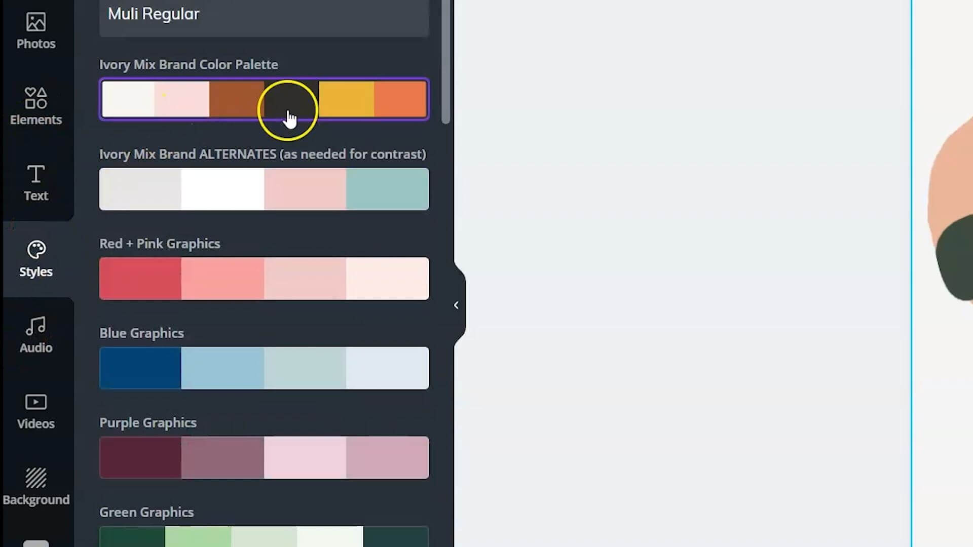
It’s looking very messy so let’s start customizing the colors. If I go to styles, I can actually click on my color palette and shuffle around the color palette.
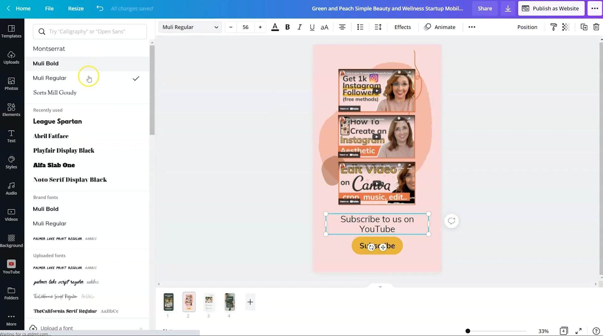
To fix the text, you can go to styles and the brand kit and click on your brand fonts.
If you don’t have brand fonts selected, you can just simply click on the text and change it to the font you want and click on the button and change that to the button color that you want.
Con: Inactive looking buttons
The one thing that this mobile website is lacking, and that isn’t my favorite part of Canva website templates, is that when someone hovers over the button, when they’re viewing the website, the button will not change color so they might not know that it’s an active button.
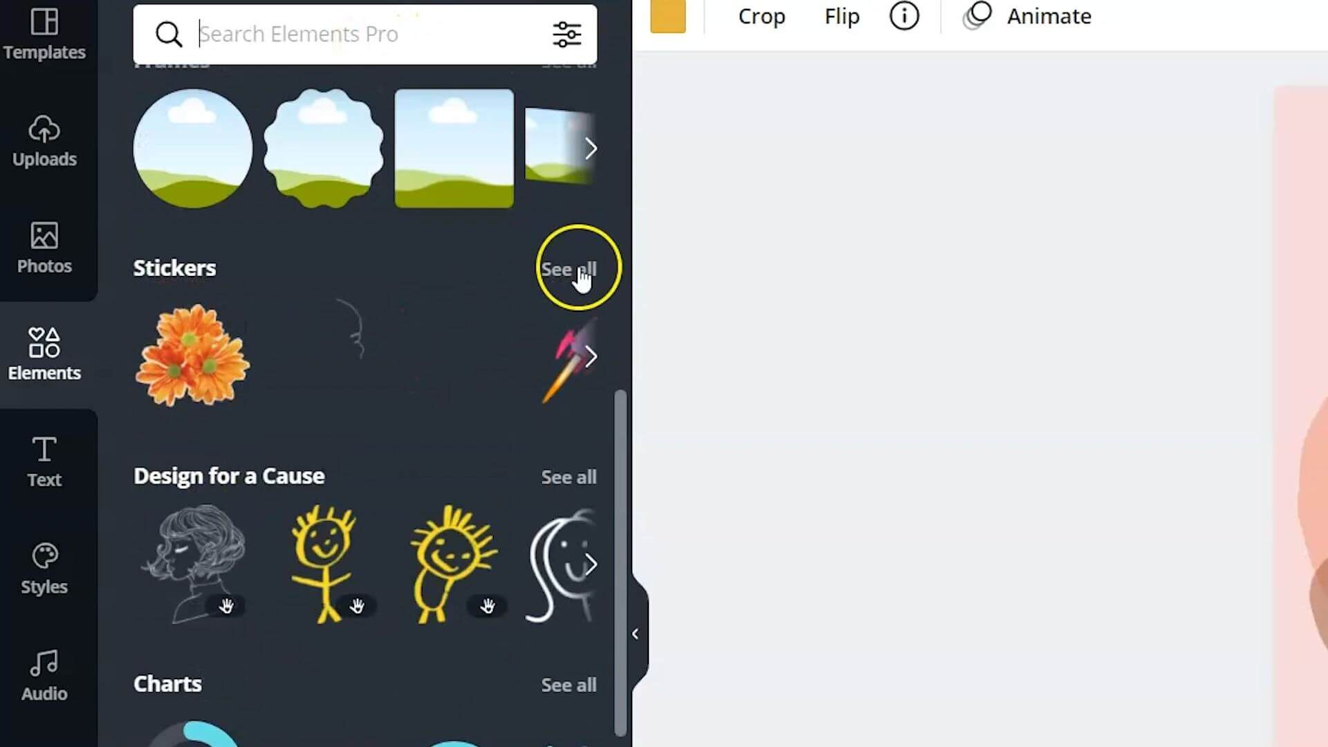
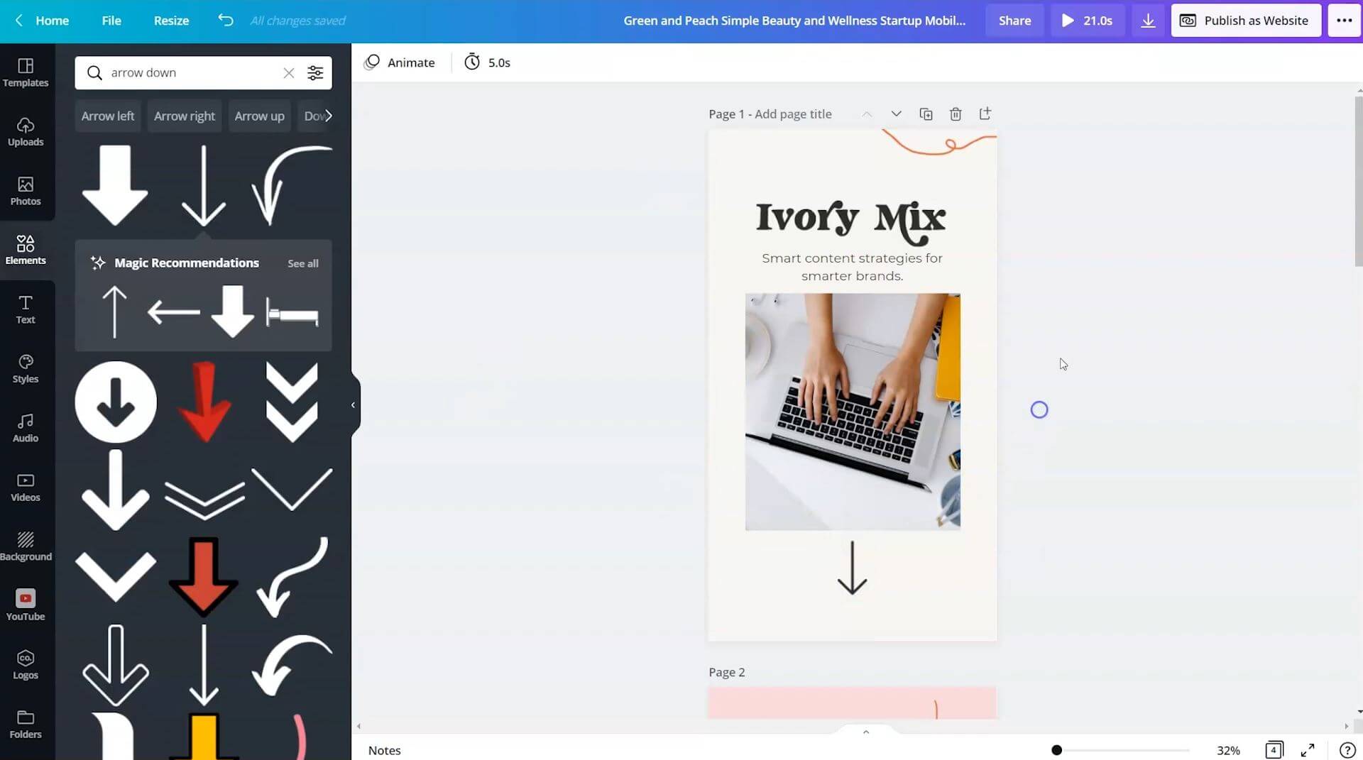
The way that you can make this stand out as an active button is by adding an animated element. If we go to elements and we search through stickers, we want to look for something that brings attention to the button.
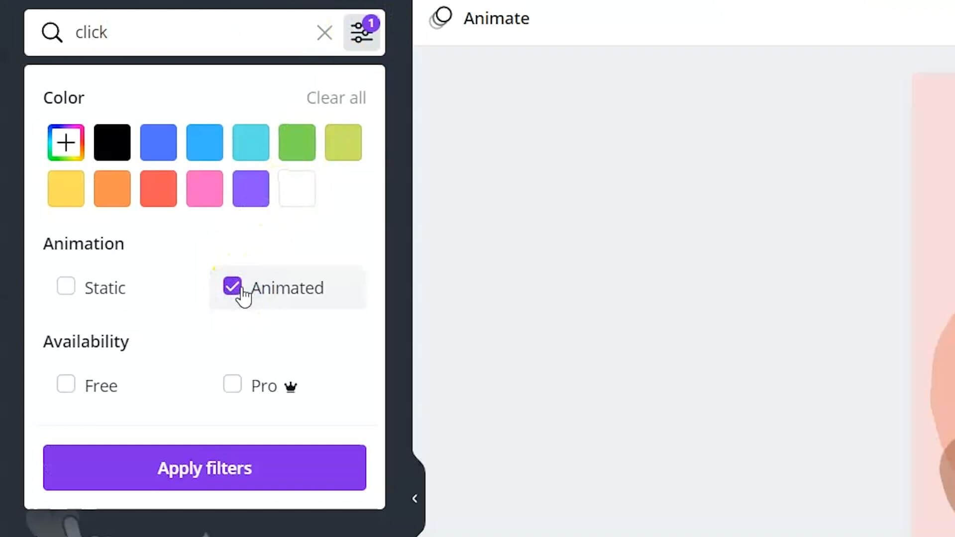
You could add an arrow, or you could type in the word “click” and filter it by animated stickers. It gives the viewer the call to action that this button will actually do something.
Add links to any graphic, text, or button
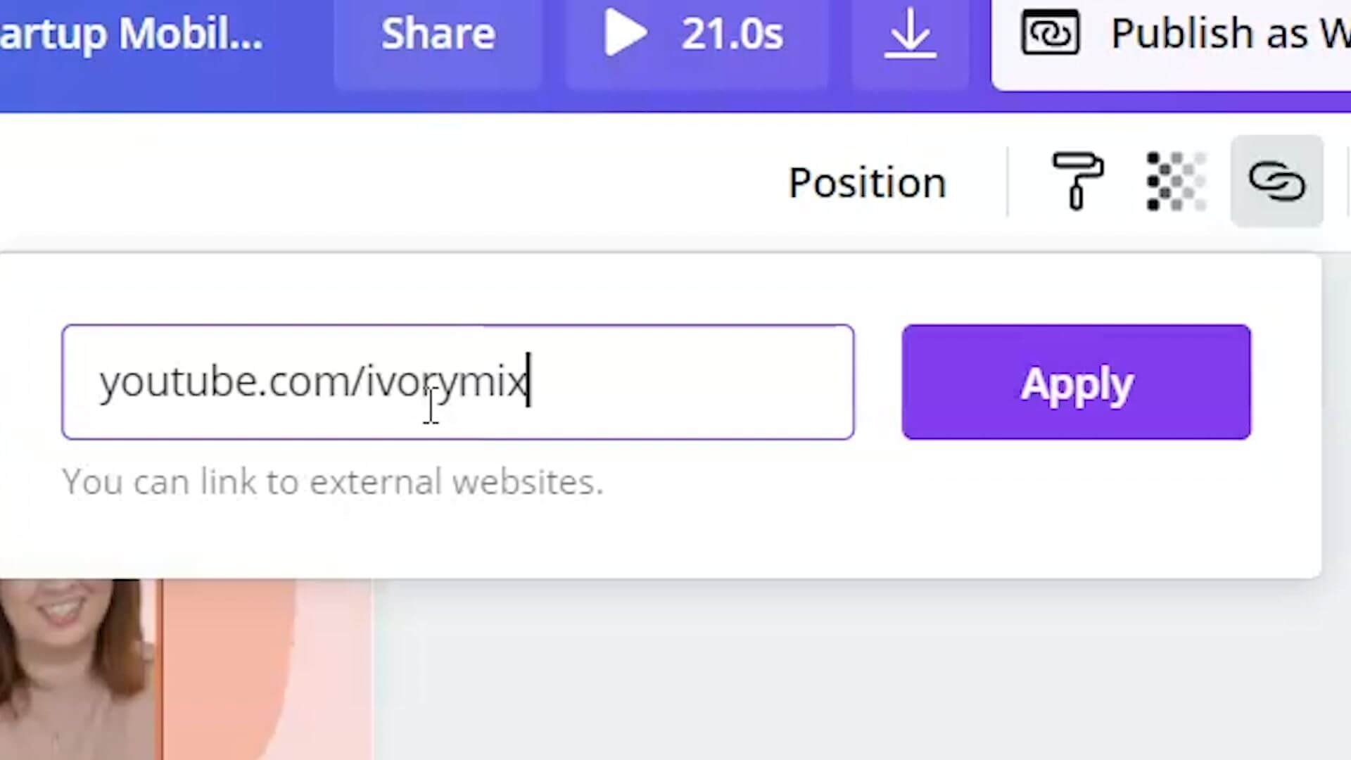
What we want to do is turn this button into a link. If we highlight the text, we’ll be able to add a link.
We’re able to click on the link icon, and we want to link to my YouTube channel, and then hit apply.
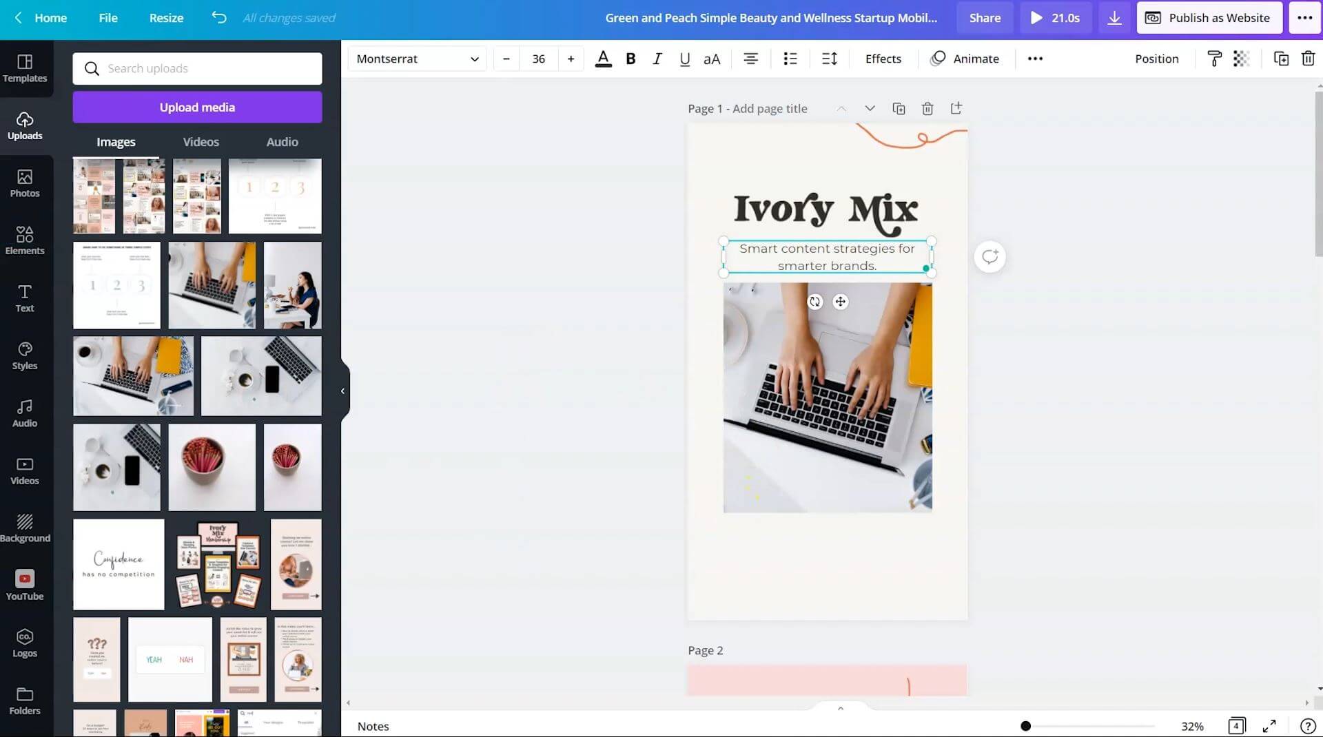
Now that we have the “subscribe to the YouTube channel,” we want to make sure the top of the website really conveys what the website is about and what your brand is about.
For me, this’ll be customized for my brand and how I help entrepreneurs with their visual marketing and strategies.
I want to add an arrow below the image to encourage website visitors to scroll below so that they know what to do next when they land on the website.
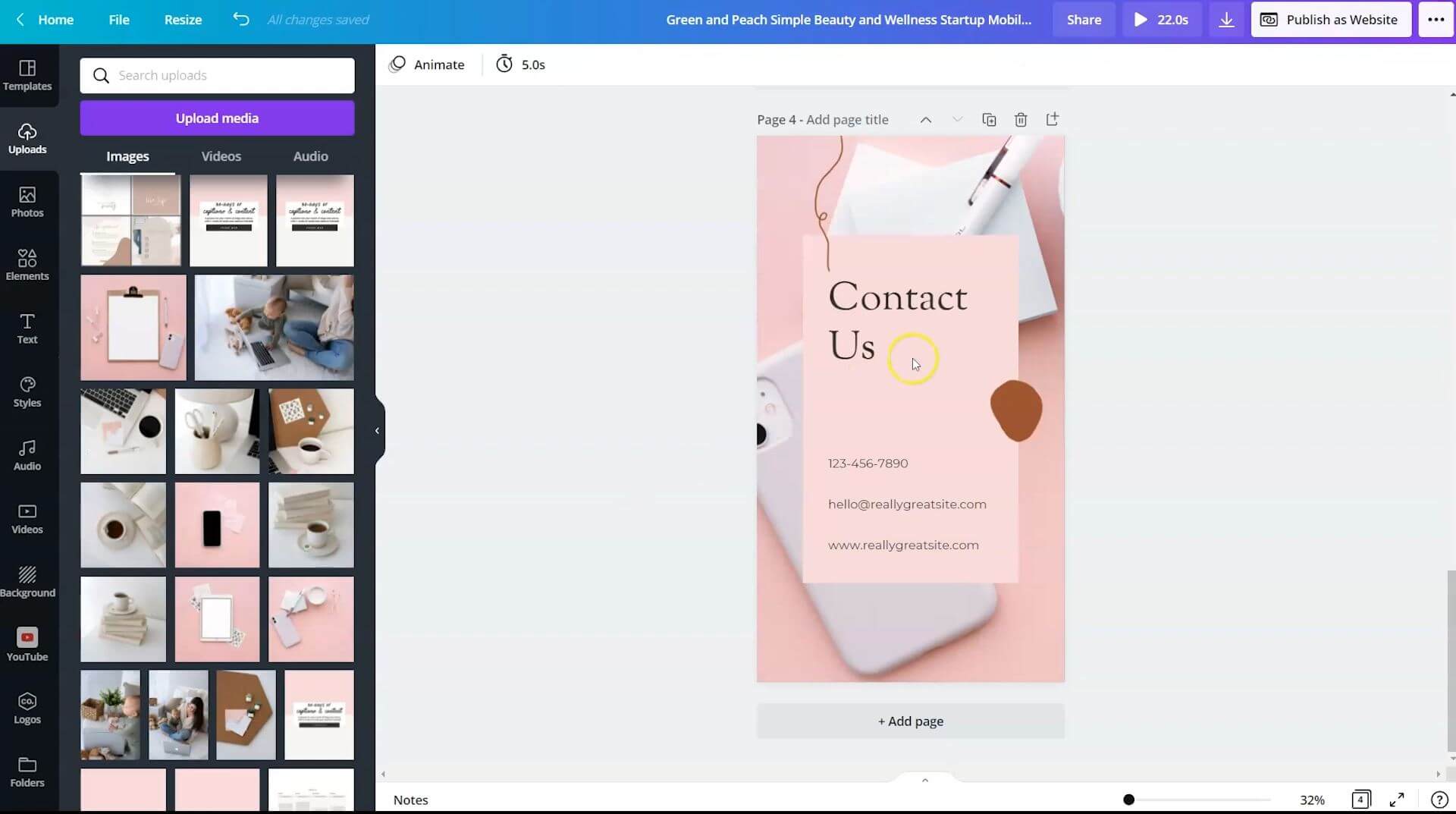
Now we need to work on the lead magnet and the contact us page.
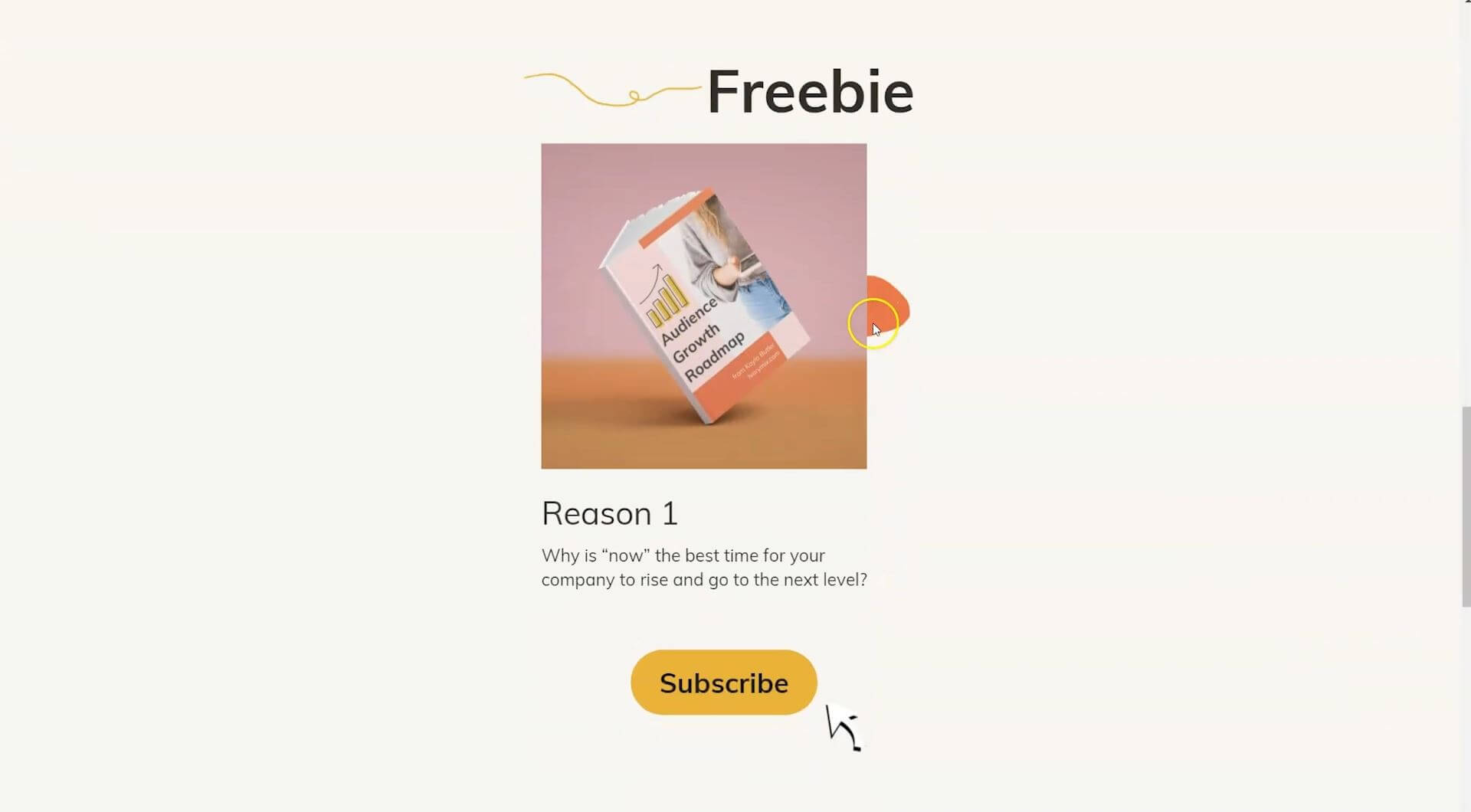
I have the audience growth roadmap here and this’ll be what they’re subscribing for. This is a freebie, and I will shuffle the brand colors to make sure everything stays on brand and in my brand fonts.
The only thing I need to do is add a link to my lead magnet landing page from ConvertKit, where people can sign up from my email list.
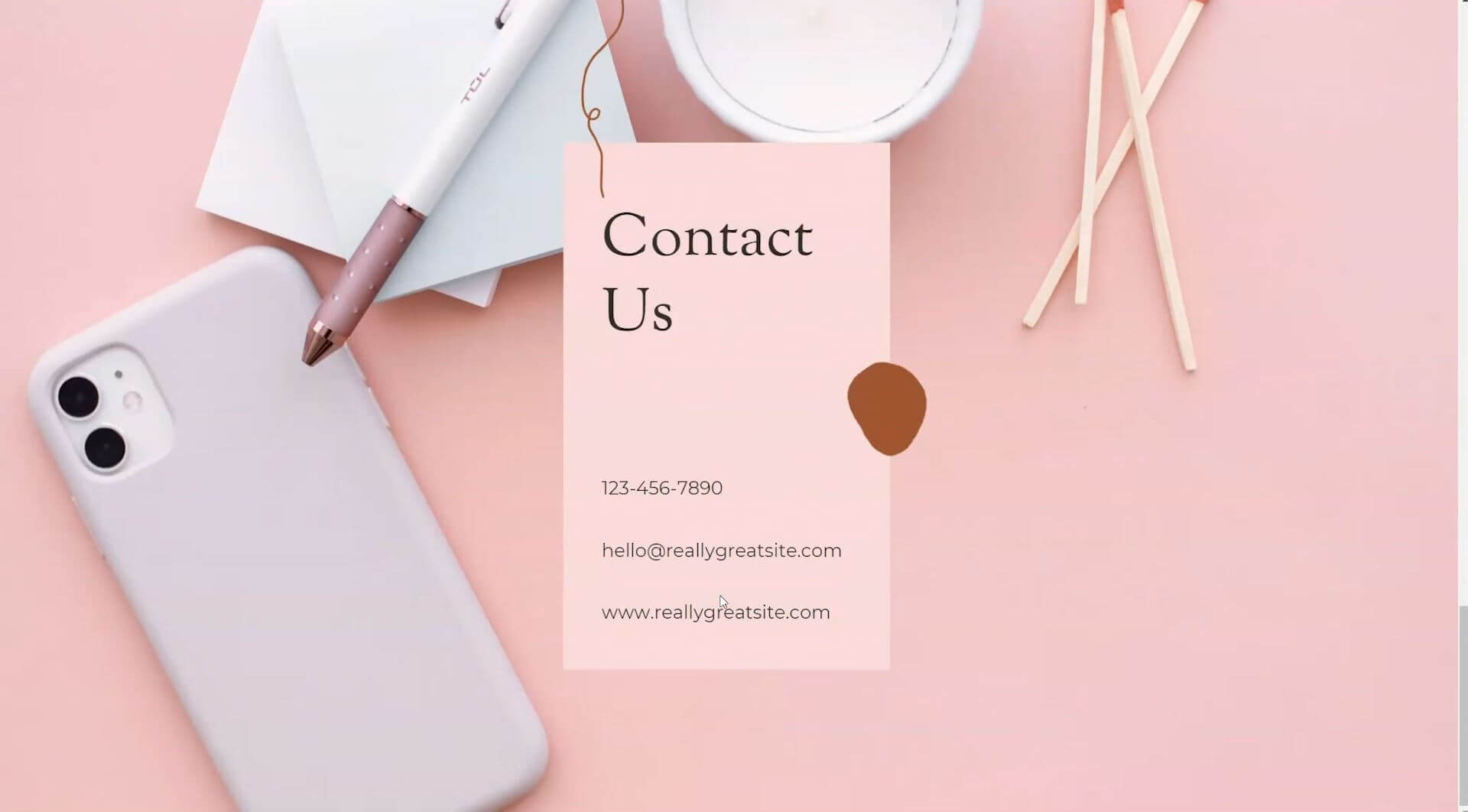
Then we want to update the contact us page. Even though I do need to make some updates with words and contact information, essentially, I’ve got a website ready to go.
Publish the website
We’re ready to publish this as a website.
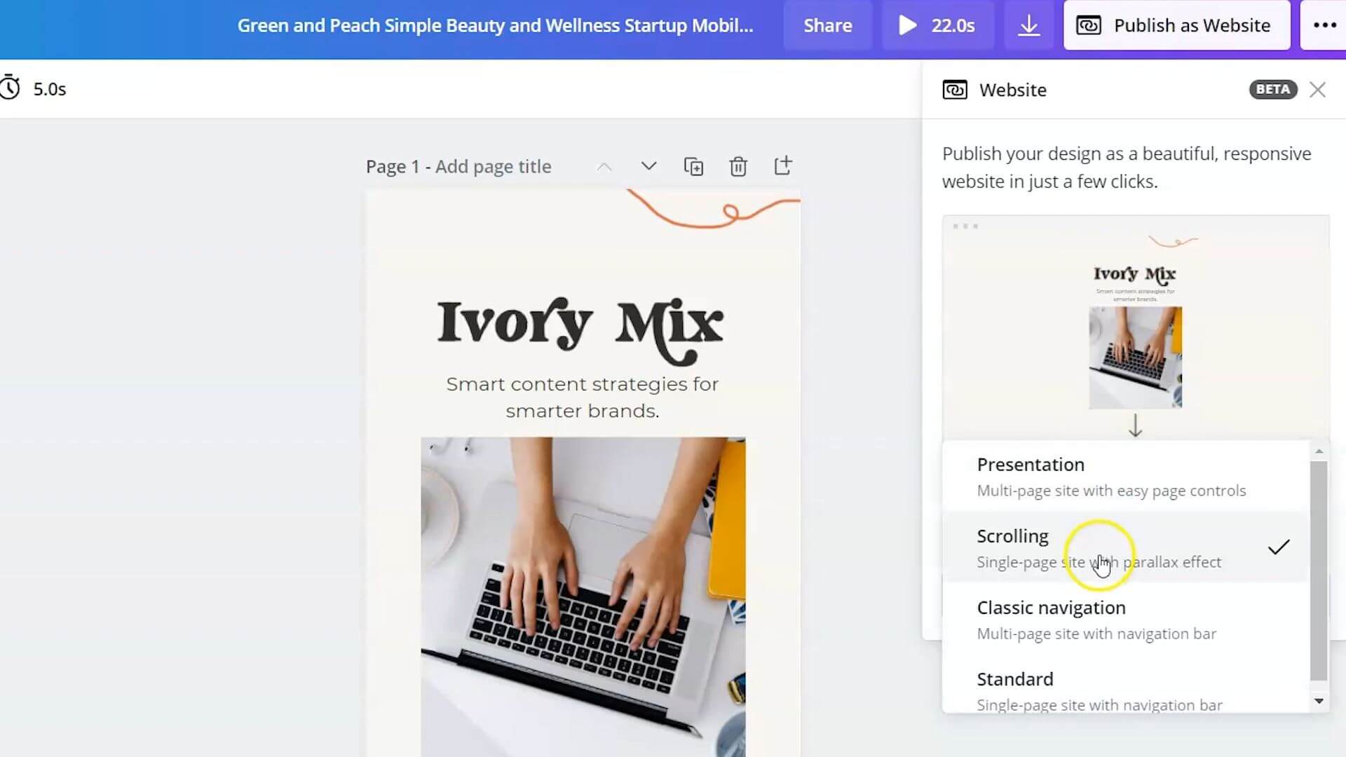
To publish this as a website, you will click on publish as a website and you’re provided with different options. There’s presentation mode, scrolling, classic navigation and standard navigation.
Because this is a mobile first website, and some of your viewers may view this website on a desktop, the best option is to choose a scrolling website.
It will modify the way that it’s seen on mobile or on the desktop. Let’s take a look at what it looks like on the desktop.
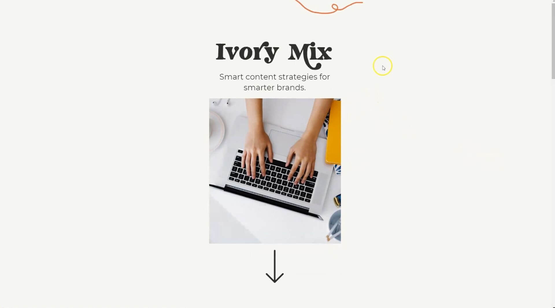
This is the top of the page, and you can scroll down.
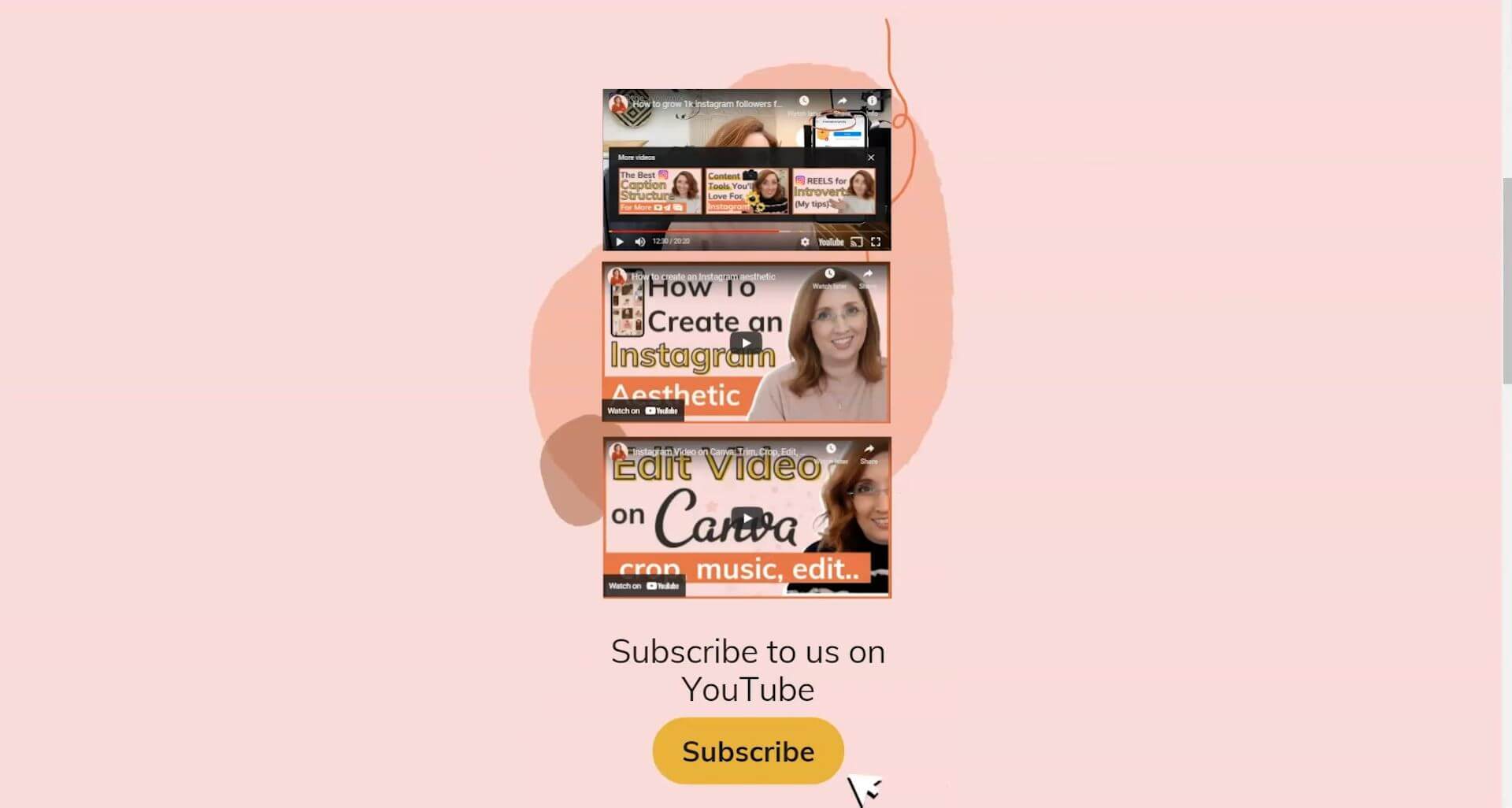
Here are the YouTube videos and you can click and play those videos. Someone can click on subscribe and it will take them to my YouTube channel.
Here’s the freebie with the button to the landing page for the freebie and a contact us information section.
It’s a perfect website viewable on both mobile and on desktop.
Con: unmemorable link
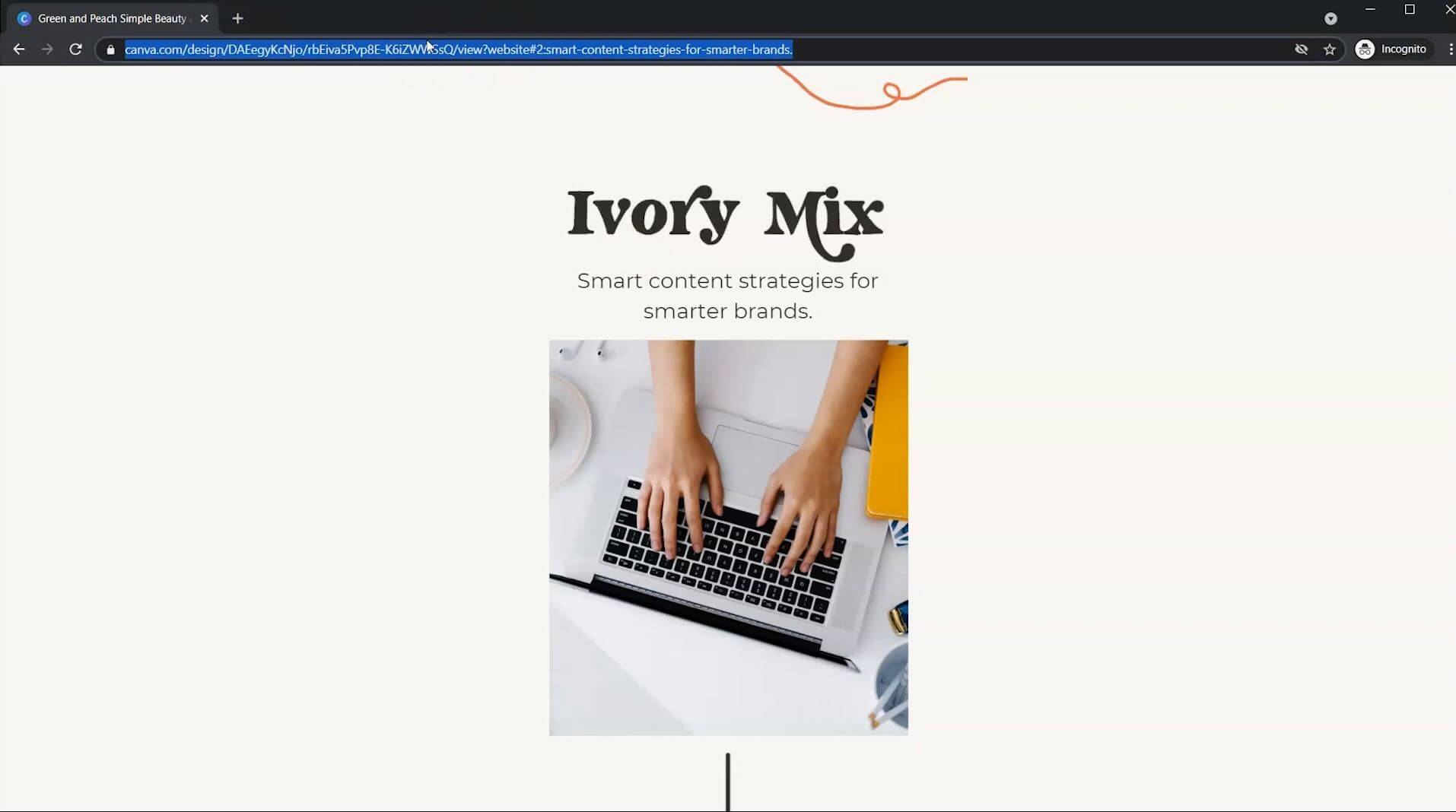
Here’s what I don’t love about Canva websites. In order to share this website with your audience, you must share this link. But that link is not very memorable.
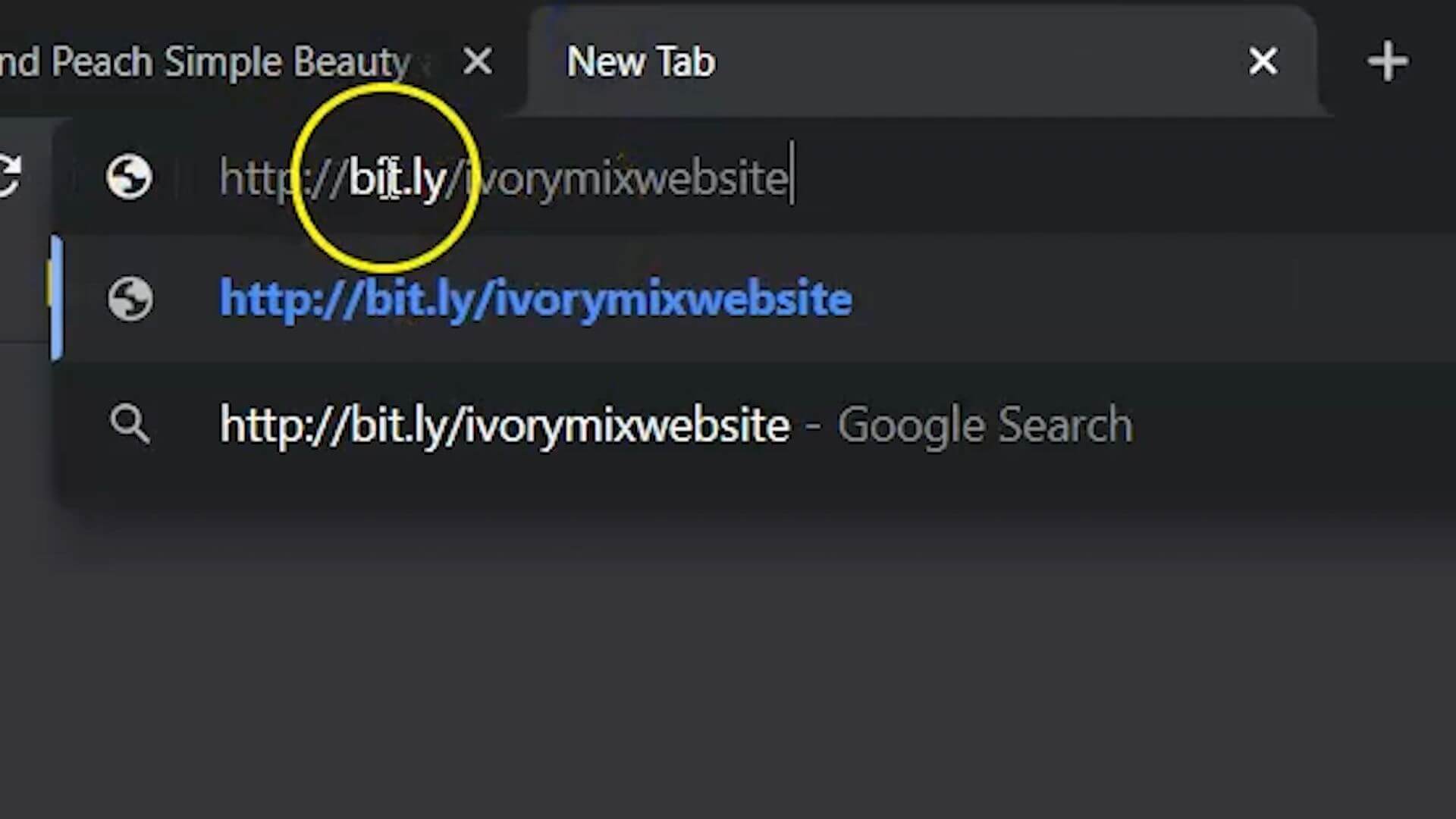
The only way to create a unique link like ivorymix.com, would to be to purchase your domain and then redirect your domain to this link or you can create what’s called a Bitly link.
You can take this link and create a Bitly link. You can just put in your Bitly link and then you can customize what it says at the end. For this, I created a bitly/ivorymixwebsite, so that it’s more brandable and easier to remember.
When you go there, it redirects the viewer to the Canva website, which makes it really nice.
Pro: Completely free
This is a completely free website, utilizing free templates on Canva, and all the elements were free to create this.
Con: Limited navigation
The other thing is there’s very little in terms of navigation. This is a one-page website.
You could create multiple pages and instead of the button going to my lead magnet landing page, it could go to another Canva web page.
Con: No search engine optimization
The other downside to a Canva website is it’s not a true website. You’re not going to get search engine optimization, and you’re not going to get a lot of the features and benefits that you get from having a true dedicated website.
However, this is a great way to get started, and it’s a great way to grow your email list or grow your waitlist if you’re getting ready to launch something and you can even sell using these websites.
If you create a PayPal checkout link and a terms and conditions and add that to this website, you certainly could redirect these buttons to a checkout if you really needed to.
However, I would definitely look at an actual website for that and utilize all the legal terms and conditions, disclaimers and things that go along with running a business online.
This is a great way to get started and a great way to prove your concept for your business if you’re just looking to grow an email list or get subscribers to your YouTube channel.
Now that you know more, what about the next step? I’ve put together hundreds of made for you stock photos and done for you Canva templates with 30 content ideas so you can get started creating content right away. It’s absolutely free!
If you’re finding it hard to get new subscribers or connect with your audience, I’ve got a secret society Facebook group, where you can join others and connect with other content creators.

Included Free:
550+ Templates, Photos, & Strategies
Get New Free Downloads Monthly
Unlimited Downloads
Special offers & Trends Newsletter
Save and sort your favorites
Access 500+ Free Templates, Photos, & Strategies With A Free Account
Free User Creation for Popup
By creating an account, I agree to Ivory Mix's Website terms, Privacy Policy and Licensing Terms
Already have an account? Log in


