get 500+ free images, templates & marketing strategies! You're one click away, Don't Miss It.
5 Smart Ideas to Improve your Pinterest Pin Designs (for More Clicks)
This post may contain affiliate links. Please read the disclaimer

It doesn’t matter if you’re a novice blogger – or have been blogging since the internet came on a disc (AOL anyone?)…
The thing is, if you’re blogging, then Pinterest is quite probably an integral part of your promoting and marketing schedule. That’s why having a distinct and beautiful Pinterest pin style is important, and why you’re reading this article right now.
Grab my Blueprint To Profits Roadmap. I’m giving you my exact 7-step roadmap for automated funnels that make consistent 30K months and daily sales. Ready to level up your business?
Want to watch a full training on this topic? Check out the video:
Once thought of as another social media platform, Pinterest has turned out to be much more than that. Pinterest is more like a visual search engine where individuals are returning to look for content similar to yours!
But, it’s clear that the difference between Google and this search engine is that a great Pinterest strategy is not only as good as it’s keywords, but it really boils right down to what your pin looks like.
Your Pinterest pin style plays a vital role in the success of your Pinterest strategy.
There are multiple characteristics of a Pinterest pin that can make it stand out and be more favorable and let’s face it – get you more clicks!
Here are the 5 Pinterest Pin Design Ideas to start sending you a ton more traffic.
1. Make those Pinterest Pins Tall
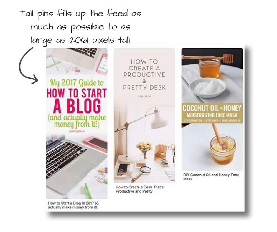
Pinners and users of Pinterest are drawn to tall pins. Being taller than most pins allows them to take up more space on the screen when scrolling.
A tall pin provides more space for additional things you may want to include too, like additional branding, graphics, text or offers..Pinterest has said that the best size for pins is a 2:3 ratio. Here’s an example of different Pinterest pin heights next to each other:
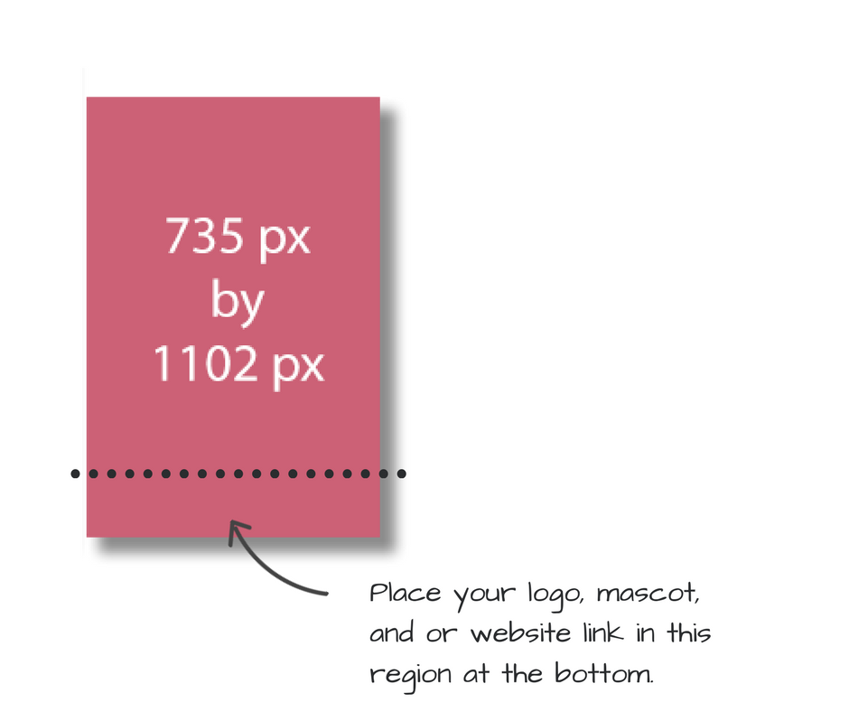
Aim to create a pin as tall as 1100 pixels to 2200 pixels tall. Use this image below as a guide.
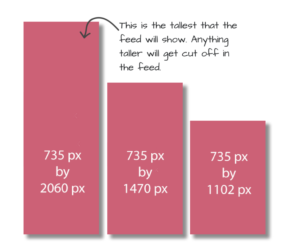
If you’re making a pin that has a lot of information, like an infographic, you can even make it taller if you need the added space. Just know that Pinterest will cut them off in the feed as they’ve capped that size.
2. Choose the right background for your Pinterest Pin Designs
There are four background alternatives in terms of your Pinterest pin style.
- White for a Background
- Color for a Background
- Pattern for a Background
- Photo / Image for a Background
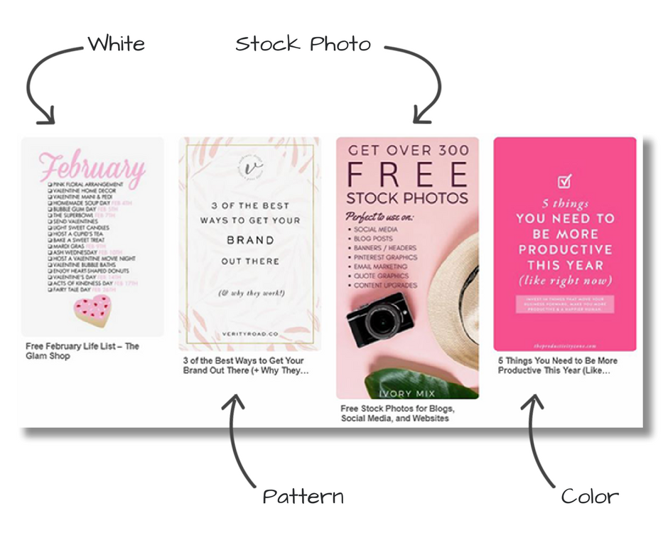
If you’re an excellent photographer, I bet you’ll want to use some of your own. But, even if you are, you might not have all the time in the world.
So, whether you are or not, we’ve got over 300 free stock photos you can use in our free library of stock photos. Click here to get your access to the free library. There’s a science to choosing stock images for Pinterest though.
Make sure to use these tricks and tips when doing your search for the stock photos:
Bright stock images are better for Pinterest
It’s been studied and proven that bright colors, especially red’s, are attention grabbers on Pinterest. Pins which are vivid and airy are typically less difficult to work with than busy pins with a wide variety of colors.
When picking stock photos for Pinterest, keep away from faces
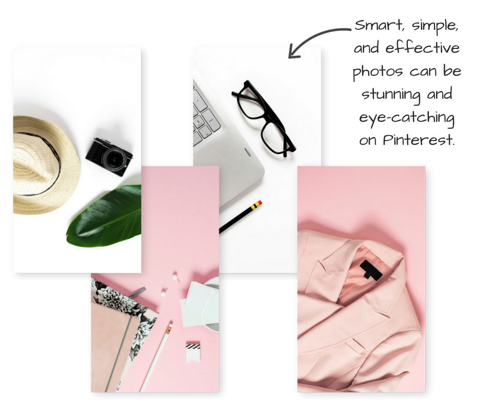
Even though they don’t trouble me, humans are most interested in pins that don’t include a face. Choose photos that help your content stand out (not compete with it) – Like out stock photos seen here, below:
Your stock photo image size matters
Ensure the image you discover is big enough so it doesn’t seem blurry or pixelated, which appears very unprofessional. In case you’re cropping or zooming in, be extra cautious! And most significantly…Be picky.
Don’t settle for the first stock image that catches your eye.
Try trying to find extraordinary key phrases until you have got a winner.
Consider all of the innovative ways you could use the photograph.
Can you zoom in on a coffee mug or an arrangement of flowers? are you able to use the background of the photo for a texture elsewhere? This offers you alternatives for the use of the image greater than once and forces you to create some repetition to your designs.
Also, don’t simply pull a photo off of Google images and assume you may use it, either.
That’s unlawful, and you can’t do this.
3. Brand Your Pinterest Pins
By creating taller pins now, you’ll find that you have a chunk of the extra area down at the bottom of your pin to make it yours. Now you’ll get another chance to make an impact on your target audience.
Utilize the final 50-100 pixels at the bottom of your pin to ensure you include your website name or maybe greater, your logo.
You may additionally inject your logo into your pins through the use of color overlays, blocks of shade beneath your text, fonts or even the textures of your brand.
All of this stuff come collectively to shape some repetition in order to have you standing out on Pinterest in no time.
4. Craft An Easy-To-Read Headline
Once you have your ideal stock image in place, It’s time to focus on the subsequent most crucial part of your Pinterest pin layout.
Whatever you do, you have to ensure that your important text is straightforward and easy to read. No tiny fonts or fonts which are so scripted that you feel like you need to decode. Select a font that people will be capable of reading as they quickly scroll on Pinterest and their feed.
To create some significance and hierarchy, consider the usage of a special slightly unique font for certain phrases or words. This is your manner of directing people to see precisely what you need them to see. It’s great to stay with no more than two fonts on your Pinterest pin layout.
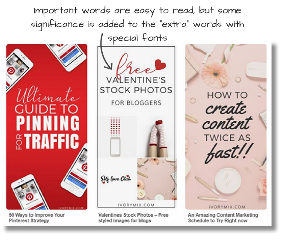
A font that has a few unique weights works nicely because you can mess around with what you need your readers to see right away, without the use of lots of various fonts.
Make sure there’s sufficient contrast between the background and your text.
Once more, a pin that takes an excessive amount of energy to examining might be lost in the feed.
5. Include a clear call to action
The use of those tall pins we’ve been talking about offers you sufficient area to throw a call to action into your Pinterest pin layout.
Yay! Use this valuable, extra area for getting your new Pinterest followers to click even more. For instance, you can see these pins have freebie opt-in examples on their pins. This shows us and tells us that there is something free when I click to read.
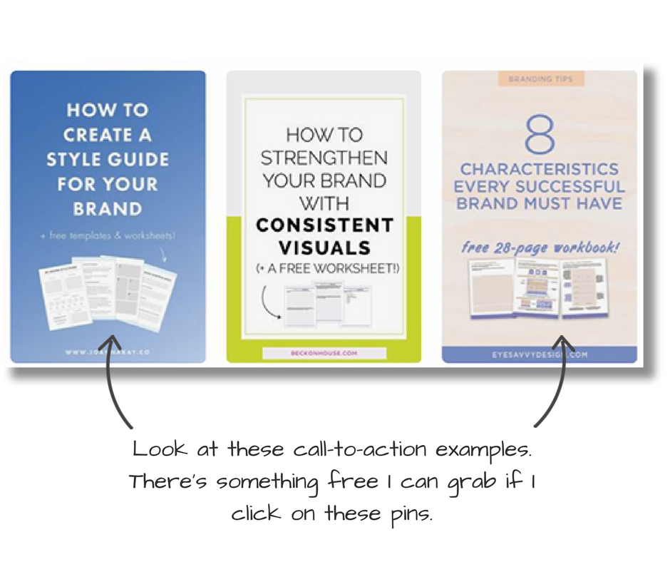
Not only do we get to read and indulge in the excellent written content, but we’ll also come away with something free to download.
Okay, So what next?
Grab my Blueprint To Profits Roadmap. I’m giving you my exact 7-step roadmap for automated funnels that make consistent 30K months and daily sales. Ready to level up your business?
Download your copy of the Pinterest Strategies eBook now
If you’re wondering what to do next, then I’ve got a complete and comprehensive 40-page ebook containing way more tips and tricks you can use to grow your Pinterest Marketing strategy the right away!

Included Free:
550+ Templates, Photos, & Strategies
Get New Free Downloads Monthly
Unlimited Downloads
Special offers & Trends Newsletter
Save and sort your favorites
Access 500+ Free Templates, Photos, & Strategies With A Free Account
Free User Creation for Popup
By creating an account, I agree to Ivory Mix's Website terms, Privacy Policy and Licensing Terms
Already have an account? Log in
4 Comments
Leave a Comment
You must be logged in to post a comment.




Amazing tips! Thank you so much for sharing
definitely!
Clear and to the point! Plus pretty as always. will definitely pin to come back to.
thank you very much